Star Wars Jedi: Survivor's accessibility options stopped me turning to the Dark Side
A new hope?
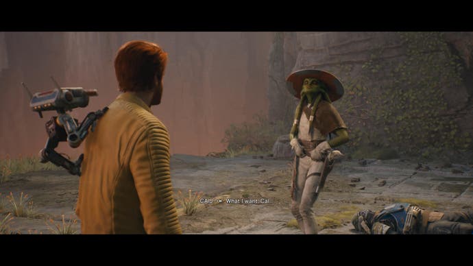
Star Wars: Jedi Survivor is Respawn's version of The Empire Strikes Back. As Jedi Survivor has the advantage of being a sequel, it can acknowledge the criticisms of its predecessor and iterate by adjusting certain gameplay elements.
"I like firsts. Good or bad they're always memorable." - Ahsoka Tano
Jedi: Fallen Order had serious accessibility barriers, from the lack of full button remapping to no toggles for hold inputs and on to a particularly indecipherable map. It was the only Star Wars game in the history of time and space that I was unable to finish, and the existence of accessibility barriers constantly made me contemplate turning to the Dark Side.
The darkest era for the Jedi Order is the perfect foundation for Respawn to explore the evolution of the Jedi, to acknowledge the unhealthy traditions that needed to be forgotten and define the type of Jedi that Cal wants to be. Personally, it's the type of narrative that grips me, discovering the heroes in the overwhelming darkness of The Empire and making the tough decision to stay in the light.
"In a dark place we find ourselves and a little more knowledge lights our way." - Yoda
Thankfully, Jedi: Survivor truly astonished me with the level of accessibility options available. The level of accessibility support demonstrates a huge shift in Respawn's design philosophy. In this blog post, Morgan Baker, EA's Program Lead for Accessibility, explains, "At Electronic Arts, we strive to reduce and eliminate unnecessary accessibility barriers so everyone can enjoy our games. Respawn showcases a true dedication to our accessibility commitments in Jedi: Survivor by considering accessibility from the start, making it a core part of their design process."
Respawn truly understood the importance of accessibility and chose the best practice by involving the disabled gaming community from the beginning. Megan Baker continues: "By embracing the disability community mantra, 'Nothing About Us Without Us,' accessibility champions from Respawn gathered direct community feedback to inform their accessibility design choices and options".
"In my book, experience outranks everything." - Clone Captain RexI will focus on discussing the accessibility settings which assisted me in enjoying my personal experience, but the plethora of options available for gamers with various disabilities is impressive.

For starters, Cal Kestis is no longer the only person with the Force-Slow ability, you're also given the power of Chronokinesis with the added Slow Mode toggle. It's a conscious design choice to allow players with slow reactions or motor disabilities to adjust the action of the world to fit their preferred challenge during both combat and platforming. I used this toggle during complicated platforming sequences in which you must chain multiple traversal mechanics like jumps, dashes and throwing your grappling hook in quick succession. These finger gymnastics would have been an accessibility concern for me, but this option alleviates the stressor of failure or multiple energy wasting tries. Jedi: Survivor has the blueprint for triple-A developers to firstly design the Slow Mode toggle and secondly demonstrate how future games could implement it.
Elsewhere, I always advocate for games to include full button remapping and Jedi: Survivor delivers one of the best implementations of the year. The level of transparency provided means every button and action can be positioned to work with your abilities, and remapping goes even further by allowing gamers to adjust button assignments for multiple button actions like throwing your lightsaber.

Jedi: Survivor has a new function called Focus Mode, which allows Cal to use multiple Force powers like Confuse when holding R1 (or RB) and pressing a face button. I regularly used Confuse tactically to gain a temporary assist from the massive beasts in the environment in order to thin the herd of stormtroopers, or by Force Pulling a stormtrooper towards me and making him shoot his allies. I would have struggled to enjoy the full power of the Force if I wasn't able to remap the default R1 + face button combination.
The only misstep with the remapping process is that it forces you to press the button you want to be assigned. This is difficult for many players if it involves pressing a button that they cannot easily press. I'd personally prefer remapping to use a drop-down menu including every remappable button when choosing your preferred control setup.
"You can't stop change any more than you can stop the suns from setting." - Shmi Skywalker
Moving on, Jedi: Survivor has a unique shortcut button cleverly designed to add multiple inputs when pressing the Touchpad (or Menu) button and then tapping a face button. The shortcut button enables you to access your Holomap and choose to activate accessibility features such as the Slow Mode toggle or Audio Ping Navigation Assist. It's an elegant solution for accessing accessibility features alongside expanding the number of buttons available on a controller.
Jedi: Survivor demonstrates that a sequel must obviously raise the stakes with the narrative, and the design team expanded combat through five different stances. But crucially, they weren't happy until they could evolve accessibility. The game does still have a few accessibility issues, especially concerning the Holomap - but there's always time for The Return of the Jedi to perfectly end an epic trilogy.


