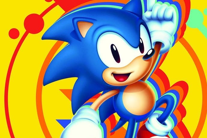
Sonic the Hedgehog was almost designed to look like arch nemesis Eggman
And other Tails from the original game's conception.
How Sonic the Hedgehog was conceived to help Sega compete against Nintendo in the early 90s was discussed during a postmortem for the original game at this year's Game Developer Conference.

Most of the talk was about Sonic's appearance came to be. Though the decision to make Sonic a hedgehog was seemingly a straightforward one - allowing him to deal damage by curling up into a ball and rolling around, designer Hirokazu Yasuhara explained - it actually wasn't Sega's only choice of character design.
"[Sega said] we definitely want to see something like an old guy with a moustache. We also want to see something like a hedgehog, or porcupine, as well as a dog-like character," he told those at the talk, attended by Eurogamer.
To help make a decision, Yasuhara narrowed down the choices in a rather unusual way.

"I planned a trip to New York while this discussion was happening internally," he said. "We drew these on a board, and I'm in the middle of Central Park, and I'm showing people these three boards and taking a survey.
"The result was that the hedgehog was the most popular, second was actually Eggman, and then third was the dog.
"So I was like, 'Wow, this is a pleasant surprise, and so I was asking myself - I wonder why this is?'
"The conclusion to me, without having nailed one single answer, was people choosing the hedgehog meant it would transcend race, gender, different types of people - everything.
"I took that result back with me and reported it back to the company."
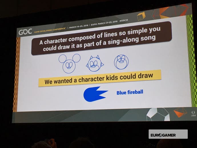
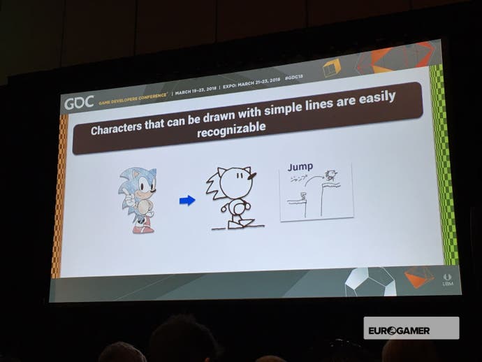
With the hedgehog chosen, the next stage was designing Sonic's appearance. The team wanted something that could be created with simple lines, something so straightforward even children could draw it.
Even though Sega had its own stable of characters around that time, Sonic was created to help with the console war against Nintendo and Mario as the publisher entered the 16-bit era - and so it had to embody Sega's sensibilities.
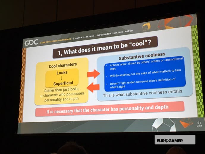
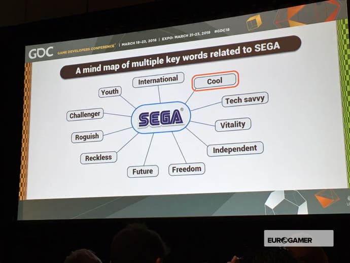
They also draw up a list of words used to describe the company to help further with the design. "Cool" was a key focus, something that was conveyed with Sonic's facial animations in the final game.
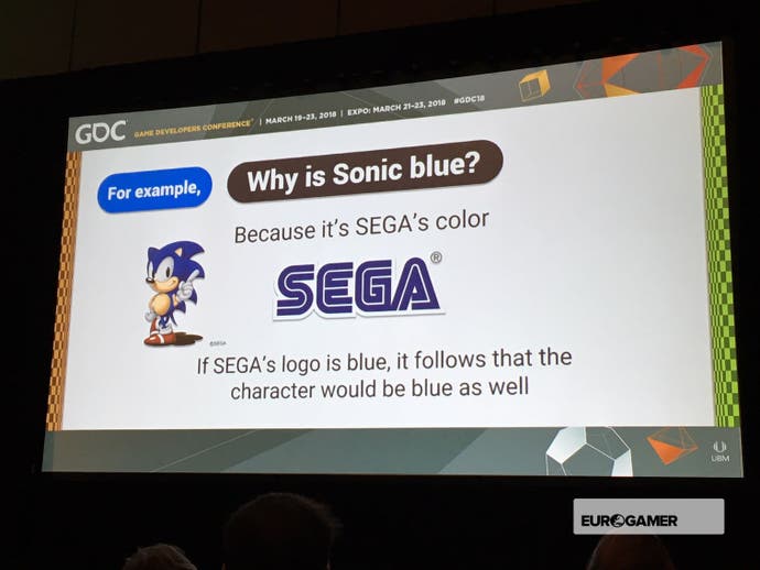
Another example was Sonic's colour choice. Why blue? Because it would match Sega's logo.
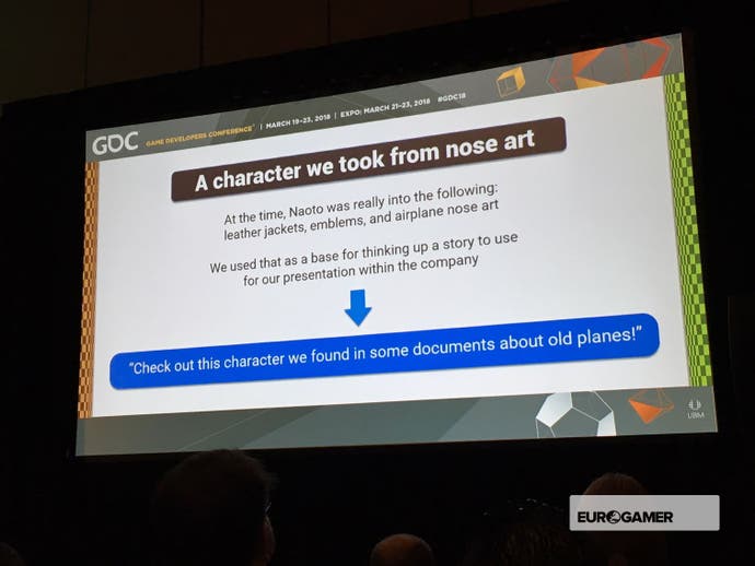
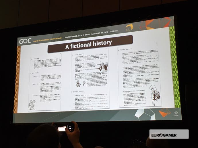
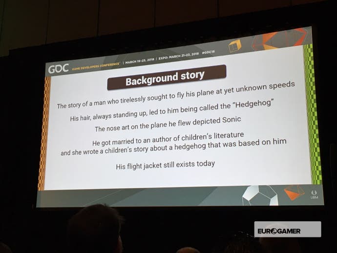
Elsewhere, a background story was thrown around by the team to explain how Sonic came to be - with the idea the character was based on a pilot, created by a children's literature author.
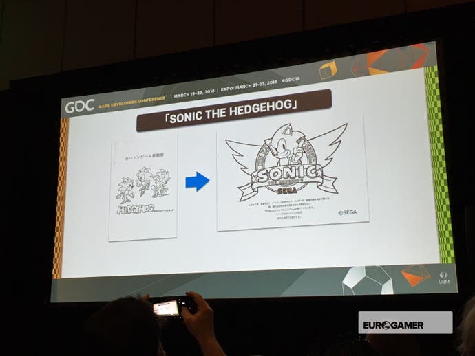
The talk also showed a variety of design sketches. When it came to creating the game, for both Sonic and non-player characters, animations were first iterated on considerably in sketch form before being drawn as pixels.
"I didn't have the same experience as an animator, nor did I have any studies in animation," Yasuhara explained. "So I spent a lot of time watching anime or watching film, scrubbing back and forth, seeing how it's done."
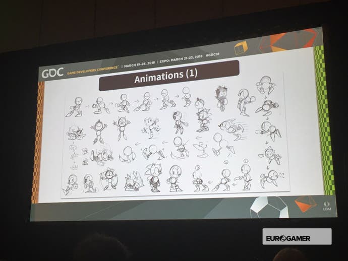
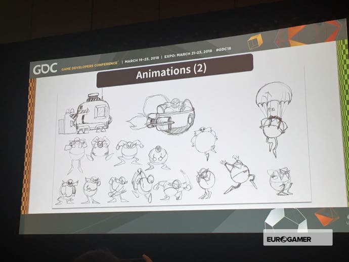
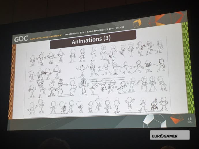
Some of these sketches were shown, with one slide featuring a dancing animation that the animator was "strongly committed" to the idea of, but unfortunately didn't make it into the final game.
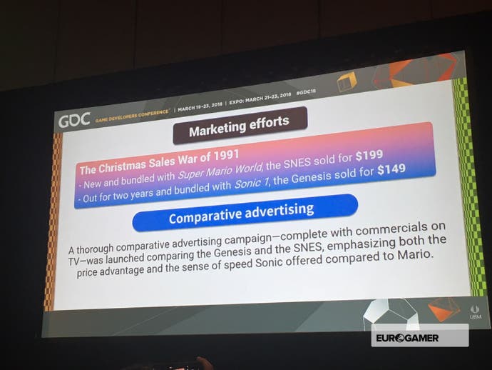
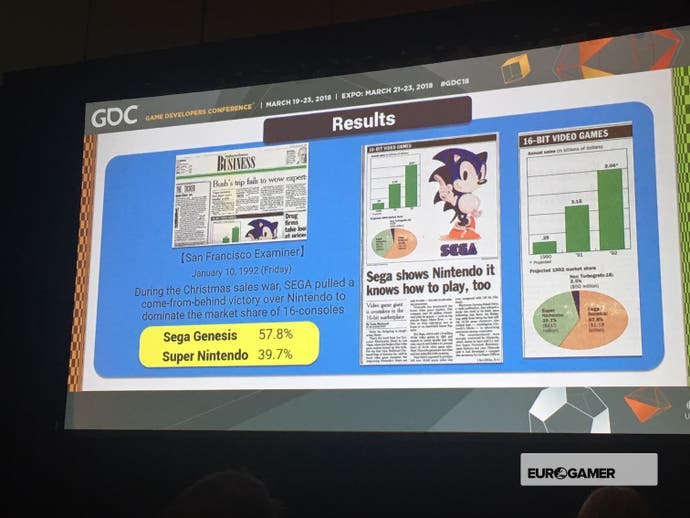
Did all this hard work pay off? With a bundle of the game and the Mega Drive offered at a cheaper price point than the SNES, helping Sega gain the upper hand over Nintendo.
The talk was rounded off with a live drawing session of the Sega mascot, with one image in the style of the Sonic we know today, and the other adopting the form of earlier designs.
What's Sonic up to now? He's set to return in an expanded version of Sonic Mania this summer - alongside Sega's later creations Mighty the Armadillo and Ray the Flying Squirrel.
