Rich Stanton on: Year Walk and the future Nintendo predicted
Finally Wii U makes sense.
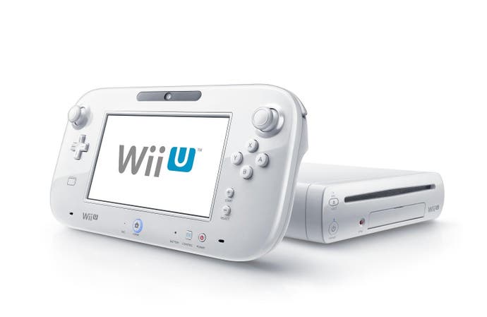
This week saw the release of Year Walk for Wii U, a game first released in 2012. Developed by Swedish studio Simogo, initially for iOS and later for PC, this definitive version has been handled by Welsh Wii U wizards Dakko Dakko - and has the power to stop you cold. This is not, as I first thought, just a great game. This is the game that finally made me understand what Nintendo thought the future looked like when it was designing Wii U.
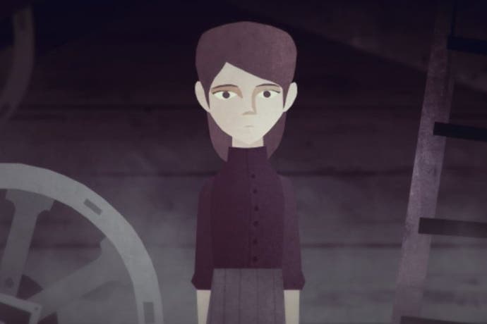
Year Walk is structured around the eponymous tradition in southern Swedish folklore, and you play a character going through it. The idea behind undertaking a Year Walk was to catch a vision of the future, and avoid disappearing yourself. The game's design comes to toy with the idea of the future, as well as luring you into fascinating digressions about the society behind such legends - and the folklore underlying Year Walk makes such an impression because of these icy glimpses of a vanished way of living. You instinctively understand why someone might want to see the future, if they lived in such a harsh world.
The twist in myths like this is often that a vision of the future, if granted, either drives one insane or acts as a curse in your own time. Beyond even that there's the possibility of deception - a mirage bending human desires to serve other ends. So who would be a prophet?
If Year Walk's themes inspire such musings, its finding a home on Wii U is perfect. For this is a console that tried to predict the future, and was junked by reality. There are all sorts of strategies hardware-makers employ while designing products that will take many years to come to market - and often the most conservative, a straight increase in power and features, works just fine.

Nintendo's way of predicting the future, under Iwata, was more about lifestyle. Not the 'lifestyle' of ads, all radioactive teeth and nuclear family, but in the sense of how people physically live in their homes - and how a console could fit in there. The Wii's 'mom friendly' approach was the perfect hardware foundation for both the living room and the accessible interface/software. But quite apart from the physical design, what Nintendo correctly guessed was that there would be a lot of people interested in gaming who didn't have space in their lives for what the industry currently offered.
Conventional wisdom has it that the Wii U's failure is down to its failure to differentiate from the Wii, the underpowered GamePad, a lack of marketing and software support, and so on. All very plausible and yet unavoidably informed by hindsight. The one aspect that Miyamoto chose to highlight, at the end of an Iwata Asks about the then-unreleased Wii U, seems odd from this perspective:
"I think what I want to say is that finally, in the long history of video games, you're now able to play our home console games only using a device made by Nintendo, and nothing else. We always depended on the television until now, but it feels like we're finally leaving our parents' house."
The remote play aspect of Wii U never really hit home, if you'll excuse the pun, despite being a great feature to have. But it made me wonder what Nintendo saw in the GamePad's relation to a larger screen, the 'family TV' if you will, that was so important the console should be built around it.

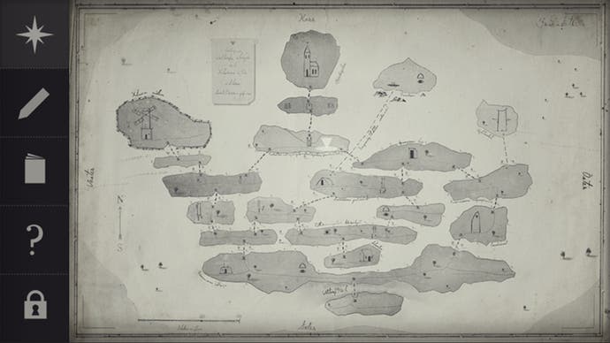
Year Walk opened my eyes to some shard of this. One of the reasons Wii U suits Year Walk so well is that the game was already divided into two apps - a first-person perspective on horizontal 2D planes, and a compendium of folklore written by Jonas Tarestad (the PC version combined them on one screen.) Though not really the focus, it would be remiss not to mention that this version finds uses for the GamePad's more unusual features like the gyroscope, and smartly changes-up touchscreen puzzles for a platform with more interactive possibilities.
All great stuff. But Wii U revitalises Year Walk's design for another reason: the simple fact of both parts existing together at the same time, in their own frame. And then even the space between the screens begins to play a part.
I realised while playing Year Walk that, after spending time exploring, i.e. playing on my TV screen, I would notice some detail about the upcoming puzzle and take to the Compendium to research. As I dipped in and out of each screen's angle on the world, my mindset shifting with the frame, a familiar feeling of being absorbed in my smartphone arose. That minor pang of remorse when you check it in company and hope no-one notices.
Many of us are guilty of, and battle against, over-obsession with our smartphones. When the first meetings to discuss the Wii's successor were being held in summer 2008, smartphones were still relatively new (the first iPhone was 2007) and tablets were yet to hit the mass-market. Since then both technologies have improved every year, and become near-ubiquitous.
I'm not here just to tell you that everyone's glued to their mobile phones, but to suggest that this shift is what Nintendo foresaw and were tuning into with Wii U's design. It's not so much that the machine has two screens, but that by the time of its release people would be familiar with negotiating multiple screens at once in a single environment. I can think of a few Wii U games that make excellent mechanical use of the GamePad, and some that exploit the fear of taking your eyes off-screen (ZombiU's rucksack inventory had to be sorted through on the GamePad, a winner.) But as I shifted from screen to screen throughout Year Walk, I suddenly understood that the GamePad wasn't about new frontiers for game design so much as guessing where they would be.
Please understand. Saying that Nintendo designed a device with multiple screens, for an age of multiple screens, is no great shakes. Anyone can understand that argument and see where it's coming from. But feeling their device slot into that groove of your brain where the smartphones and tablets normally sit, in essence taking advantage of a modern routine, is something new.
Now that its commercial failure is confirmed, few have a kind word for the Wii U concept and any internet commenter can explain why it was always doomed. Which is all fair enough, but Year Walk made me realise what Nintendo was going for all along. After making the definitive living room console in Wii, the successor was planned for a new kind of living room - one where the monolithic family television was now surrounded by smaller competitors, and people were not only comfortable with but enjoyed jumping between screens.

The bit Nintendo didn't get right, which made everything go wrong, was how fast these devices would improve. The GamePad is a much-maligned bit of kit but that's because it was being designed before the first iPad was released, after which tablets took off and became very powerful, very quickly - not to mention what happened with smartphones. It's not that Wii U was ever competing directly with any of these devices, but it was designed to co-exist with them - and even at release didn't look the part. The concept absolutely does tune into something that has happened in our living rooms, but by release the hardware didn't have the finesse to exploit it.
One final point on how game designers think about hardware, or more often fail to. Simogo initially designed Year Walk across two apps - the game and the companion - with the twist being how they would eventually combine. The designers made the decision that the effect of switching between apps on a smart device would make a more powerful impression on the player than simply integrating both parts into one package. This choice would strike most developers as madness, yet in this specific case it works.
Such insight - not just great interface design but a sense of how people interact with the physical device, and the expectations inherent in that - is what makes Simogo's games special. And you could say it's what makes Nintendo's hardware special, regardless of what the market says. The idea of app-switching becomes, in this outstanding Wii U version, screen-switching. The game is pulling the same strings, switching our focus here and there, but now in a structure that feels custom-built for it. All of this is a happy accident of course, resulting in a fantastic game for Wii U owners but little consolation for Nintendo.
Predicting the future can be a risky business. It's one of the reasons I tend to scorn analysts who pretend the console business is easy or predictable. When you're placing bets years into the future some sort of divination is required and, even when you guess right, the world can still leave you behind. Every games console was once a vision of the future, a Year Walk of its own, and Wii U isn't nearly as bad a guess as you think.
Nevertheless, the industry's history will be written by the victors. Leaving the future, once more, up for grabs. In some tellings of the Year Walk a person would see a future that they could yet change. Not all of them did, or could.
This Year Walk makes the Wii U's design come alive, if only for a few hours, and in that it is beautiful but bittersweet. A glimpse of a future that never came to pass, tinged with the knowledge that it's all-too-late for Wii U to realise. Such thoughts are the preserve of players. Nintendo can only focus on what's NX, rather than what might have been.


