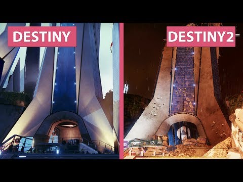
Destiny 2's Tower compared with Destiny 1's Tower
High rise.
Bungie, free from the shackles of the last generation of consoles, has built Destiny 2 for the PC, PlayStation 4 and Xbox One. So, fans expect an improvement when it comes to the graphics. With the Destiny 2 beta now live, we're starting to see how much of an improvement Bungie has managed.
The video, below, from YouTube channel Candyland gives us our best comparison yet between the graphics of Destiny 1 and the graphics of the Destiny 2 beta.
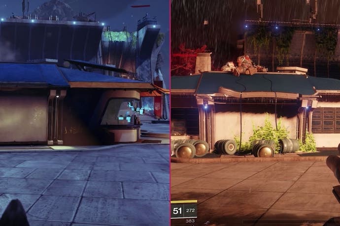
We see Destiny's Tower as it is in the first game, pristine and free from violence, compared to the Tower as it is at the beginning of Destiny 2, when it's under siege from the Cabal. Familiar landmarks such as the tree are on fire. Walls are crumbling. Ceilings are caving in. The Tower is, essentially, in bits.
While Destiny 1's Tower has a day / night cycle, it's always enjoyed calm weather. Destiny 2's Tower is drenched in impressive weather effects, which we see in the opening story mission. The action is battered by wind and rain, which make for a more exciting scene.
Oh, and one other difference: the railings in the New Monarchy lounge are different in Destiny 2, for some reason.
The comparison video doesn't paint a complete picture of the graphical difference between the two games, of course. The beta only offers a snapshot of the final game, so it's hard to judge the work done. But still, it's cool to look at familiar parts of the Tower from the same position in Destiny 2 and Destiny 1.


