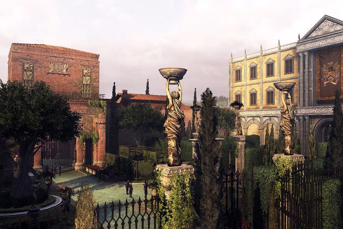
There's more to Assassin's Creed's Renaissance Italy than meets the eye
Digging deeper.
Editor's note: Rob Dwiar is a garden designer, landscape architect, horticulturist and writer who regular Eurogamer readers may remember for his analysis of The Witcher 3, Mass Effect and Dishonored, his essay on the genius of Rapture and his thoughts on the close quarters of Dead Space, Metro, The Last of Us and Oblivion. Now, to coincide with the 10-year anniversary of Assassin's Creed, Dwiar takes a closer look at Ubisoft's remarkable recreation of Renaissance Italy, and finds there's more than meets the eye.
Since it began 10 years ago, Assassin's Creed has captured imaginations with secret organisations, myths and mysteries, but also made great swathes of history accessible. Being able to explore and interact with places and people of the past has promoted an appreciation of history, down to the features, elements and facets of life of that time, such as historical politics and power struggles, mythologies, social structures and people, and architecture and design. These elements of historical presentation give Assassin's Creed games and their environments great depth and sense of place and act as environmental guides and markers. Arguably, none were better than Ezio Auditore's Renaissance Italy, which had places that went beyond 'great recreations'. While spaces such as town squares, gardens and designed landscapes were fun elements of the landscape fabric to explore and parkour across, they often demonstrated distinct design trends and techniques of the time, while maintaining their in-game ability to act as narrative exaggerators, theme reflectors and design-centred, geographic markers and navigators, all of which served to enhance our experience.
Florence is oft cited as the birthplace of the Renaissance, and one particular family embraced this through design. The infamous Medici family was one of the most powerful and important in the region (clearly highlighted in the games), and were not shy about ostentatiously displaying their wealth, power or influence and made sure to show it through their homes, grounds and gardens. At first glance, the Palazzo Medici in Florence is not overtly enormous or magnificent - at least from beyond its walls - but it is, and it is one of the few urban residences with a garden. What looks like a simple design actually has powerful themes running through it and is built for more than aesthetic pleasure.
The enclosed nature of the courtyard garden and its integration with the Palazzo's architecture is the first giveaway sign. Strong, straight lines govern the dimensions and proportions of the space indicating themes of order and power. This ensured unity with the architecture and consistency in design, to the extent that house and garden were seen as a whole, not two separate parts.
The rectilinear design - the only curves are part of the walls' design - makes for an ordered, dominant space, be it entrance, entertainment space or a forum for political discourse, and ensure visitors are surrounded by Medici magnificence and influence. This is further heightened by there only being ground-floor-level windows facing in, toward the garden, focusing attention on Medici splendour and power.
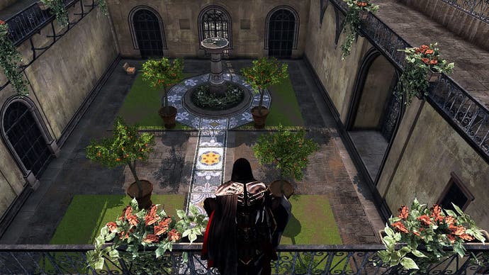
The strong rectilinear design makes for a relatively simple spatial and functional layout - it still had to serve as a thoroughfare and entrance. Formal lawns, focal-point plants and simple paths evoke the look and feel of an ancient Roman peristyle garden: a simple, functional layout, with a covered walkway circling around a central courtyard populated with formal garden elements - aligning with the Renaissance theme of rediscovering the classics of ancient Rome. The path, designed to loop around the centre of the courtyard, heightens the idea that the Medici property, and the family, was a centre of power. The importance of the garden in presenting power and political theatre, in the context of the game, and in the form of a calculated, deliberately designed space cannot be understated.
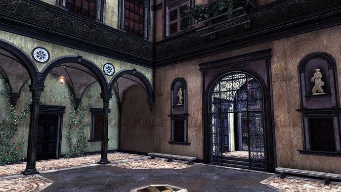
Though not as flash as the Medici family, the importance of statement design is apparent in the Auditore courtyard. They too would have ensured similar approaches were utilised in their courtyard. It is a dominating enclosed space, governed by rectilinear forms and lines in order to relate proportionately to the building. There is ample space for entertainment, and it has ornate flourishes adorning each surface and decorative statuettes in symmetrical alcoves. However, there are plants used to frame and soften hard edges, perhaps indicating less of a need or desire to dominate guests through design.
It is widely accepted that imagery, meaning and portrayal through design would have been clear and unmistakable to the people of the time. In the context of Ezio's Assassin's Creed, these designs mirror and exaggerate the games' narratives and underlying themes - power, order, influence, political drama and symbolism.
Though not a centre of enormous wealth or power, and after Ezio has given it a revamp, the villa at Monteriggioni brilliantly shows that design techniques - and their symbolic importance - permeated down the social order. Location is critical and necessarily starts the whole design off. The countryside location is representative of where those who could build extra residences would: outside the city in order to escape the heat and bustle - it provided a sense of physical safety, well-being, relaxation as well as a place for intellectual alertness and recuperation (mirrored in the game through Ezio's attachment to, and use of, Monteriggioni).
Substantially raised above street and surrounding-landscape level, the villa has a commanding view over the land as landowners were keen to maintain a constant eye over their wealth and denizens, maybe fuelled by paranoia, but certainly as a symbol of status and power. It is a near-perfect recreation of a countryside villa as defined by Leon Battista Alberti's principles (one of the most important design influencers of the Renaissance). He stated the Renaissance man's villa should both see and be seen and, utilising the elevated site, should enjoy the benefits and delight of a cooling breeze, the sun and a view. A great portion of this view according to Alberti, should be made up by the delicacy of a terraced garden, which meant that impressive retaining walls were needed with grand balustrades and staircases required to link the terraces and garden to each other and to the wider site - all of which can be clearly seen at Monteriggioni.
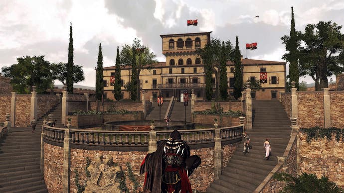
With the important lie of the land executed elegantly, the villa's garden exquisitely heighten the impact of the villa's design: pencil-shaped cypress trees, aligned and evenly arranged, provide upright punctuation indicating order - these also dictate the main perspective in the design and guide the eye toward the centre of the villa; ornaments and sculptures dot the garden providing points of interest and prestige; and the plantings are arranged symmetrically, in conjunction with neat lawns.
Plants had an elevated importance and were seen as a means through which to demonstrate power and wealth: villa owners such as the Medici family liked to fill their country residences with rare plants such as alba roses and all kinds of dianthus species, showing a taste for the exotic and striving to own what others could not. All these elements work individually as formal, Renaissance garden features, but collectively they enhance the feeling of power through man's perceived dominance over nature.
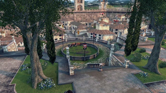
The juxtaposition of ordered and designed spaces and the wider, serene Tuscan landscape of pleasantly rolling land, informally arranged productive fields and the remnants of olive orchards, is deliberate and exaggerates the sense man has tamed nature. This contrast is gradual, subtly introduced by the deliberate alignment of signature cypress trees and holm oaks planted alongside and near the entrance tracks respectively, giving a clear sense of approach and arrival, but also beginning the display of the owner's power and dominance and that of taming nature.

These theme-imbued, distinctly designed and portrayed spaces, mean we never feel lost or overwhelmed in Monteriggioni. Through environmental design, the game excellently portrayed a space that quickly became familiar, using landscape elements as navigators and guides.
The city of Venice is itself a marvel of design, built on a salty lagoon and supported by thousands upon thousands of felled trees arranged so economically to form a tightly-knit urban centre. Despite being so closely packed, it still has, and had in Ezio's time, room for some of the most original designed spaces and features that, again, serve a functional purpose while adding something that is beyond the aesthetic.
Short on space, the people of Venice often started to look up rather than outward to build, to extend and to add green spaces. They were Renaissance Italians, so desired and saw the benefits of gardens and plants. Verdant balconies and window boxes adorn the exteriors of buildings adding softness to the architecture, filled with a range of plants, possibly from all over the world given Venice's monopoly on inter-continental and intra-European trade. The vertical frames and panels we see alongside those in Ezio's Venice may be a bit of artistic license in action, but they are based on some solid principles: softening hard edges; providing space to grow plants, or even produce; framing windows to add to the architectural character of buildings; and to emphasise and further a connection to the natural - Venice's waterways adding to a broader garden feel, almost.
The design of such exterior plantings would have also served a purpose: in summer, the Venice air would have smelt dreadful, given how the Venetians treated and used the waterways at the time, so plants on the panels and balconies that exuded strong perfumes would been incredibly useful at masking the unpleasant smells.
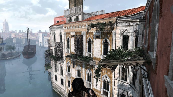
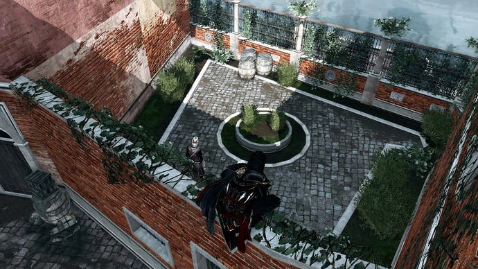
Given the lack of space in Venice, there were, and are, few gardens, private or public. Any that did exist were small, often with only a single tree, a couple of climbers like roses, a few shrubs such as myrtle, and often sat near to the water's edge in the form of small pocket gardens. Their waterside location aided the smell-balancing principle the panels and balconies had, but also resulted in a pleasant garden design trait by combining gardens and water. This functionality as garden spaces is also confirmed by the pleasant pockets of greenery becoming small, restful spots among the busy streets and canals of Venice.
Even though they are modest and perhaps imbued with a bit of developer's license, these spaces displayed some of the clearest prevailing aspects of Renaissance garden design: symmetrical, proportionate and geometric layouts for order; simple, formal lawns for structure; focal points to guide the eye and draw perspective; and deliberately chosen plants, be they climbers or in pots, to ensure a garden feel.
However, alongside this faithful recreation, there is a final flourish to these Venetian gardens. They are almost always enclosed by walls or fences, with only one entrance; this beautifully mirrors, and facilitates, the culture of clandestine meetings of the Renaissance elite, and the secret machinations of the organisations governing the narrative. That gardens and their design can actively promote secrecy and seclusion is a brilliant method of maintaining themes critical to the game through the use of environment design.
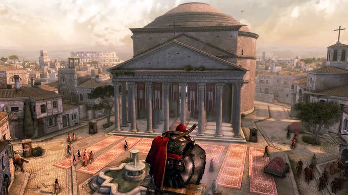
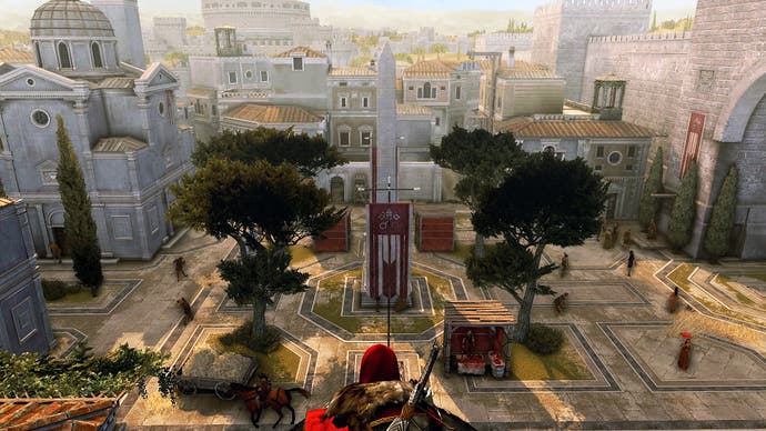
Rome is a thriving city with a diversity of spaces, designs and architecture - the influences of the Ancient and the Renaissance both apparent. Outside of the opulence of the Vatican, the designs that shine the brightest are in the public domain, in the form of squares and frontages of prominent buildings. While these may be seen as purely functional spaces and therefore easy aesthetic recreations, squares such as the Piazza del Popolo and the space outside the Pantheon are centres of design and exaggerate some underlying themes.
Along with their function, be it provision of space for religious services or markets, squares such as these were public spectacles of designed grandeur that provided snippets of magnificence for all citizens to experience, even if only passively. They were bold statements on a scale greater than the individual that exaggerated Rome's perception of itself as a centre of power. The centre of a powerful empire no more, perhaps, but certainly the centre of religious power and close to the centre of the Renaissance, and these squares were miniaturised encapsulations of this.
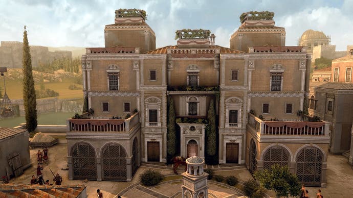
This public-facing power of design extended to building frontages, particularly where there was an opportunity to flaunt opulence. The Rosa in Fiore brothel was particularly successful at forging its own style. Greenery is introduced through verdant plants tumbling out of terrace planters and climbers wrapping themselves around wooden structures, while symmetrical, elegant, upright trees guard the front door and neat plants soften surfaces and edges along the central axis of the architecture. The resulting, overall lushness and softness provided by the plants ensures the brothel's rectilinear architecture and geometry does not overtly clash with the circular geometry of the square. Perhaps reflecting or implying the softer touch which could be found within and to increase the general appeal of the building as a whole, both would serve as deliberate reinforcements and reminders of the themes of decadence and opulence through design.
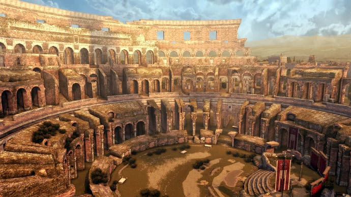
Finally, there was a last, design-related gift in Rome's wider landscape. By folding the infamous ancient Roman monuments and buildings back into the landscape, merging them with Renaissance architecture and design, the environment takes on a palimpsest quality, with myriad layers of history, people and culture. Conveniently, and importantly, this neatly mirrors the multiple layers of the narratives, the conspiracies and also of the Assassins and Templars.
The inclusion of such accurate yet multi-layered design throughout Ezio's Italian travels is beneficial far beyond executing faithful recreations. The spaces benefit the game's design on a much deeper level. The environments were not only backdrops but design-centred markers and guides, subtle aids exaggerating or reflecting in-game themes, educational and spatial story-tellers and presenters of information. We are immersed in Ezio's world: the designs giving the environments extra historical, atmospheric and narrative dimensions, and an incredibly strong sense of place. It's an incredibly pleasing way to experience the past, interact with it and become quasi-active participants in history and historical events, in wonderfully vivid and layered environments.
