The close quarters of Dead Space, Metro, The Last of Us and Oblivion
Uncomfortably brilliant.
The environments of massive open-world games, particularly in recent years, have been rightly praised for their representation, scale and design accuracy. However, there are some gems at the other end of the spectrum - environments that make you feel cramped, tense and desperate for a break. This is an approach to environment design utilised in our real-world, from gardens to architecture, and is mirrored excellently in some game environments, creating areas that trap us in cramped, claustrophobic conditions.
The underground tunnel network of the Metro series, adapted for human life but traversed with trepidation and tension, nailed its own post-apocalyptic look and feel, and had claustrophobia, discomfort and fear oozing from its design. These spaces successfully evoke real-world design principles of landscape mazes and labyrinths, such as dead ends, twists and turns to cause doubling back and elevate desperation, fluctuating size and scale of spaces, and a continuous and monotonal finish (a symphony of grey in Metro's case) that makes every surface and area look the same, but also makes for an unrelenting and repressive aesthetic.
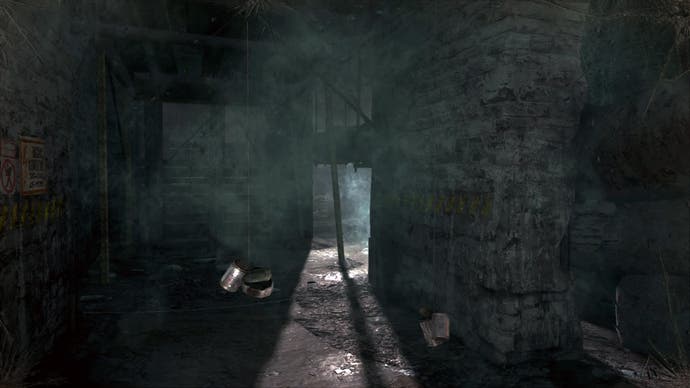
Often, the spaces are not only characteristic of uncomfortable mazes and tunnels, but their disrepair and crumbling structure means they have a constant feeling of pressure and weight about them: the feeling that, at any moment, the space could collapse on top of Artyom's head. The tunnels are also powerful spaces as they are a believable and familiar environment to us; adapting a real-world, recognisably claustrophobic environment makes for a powerfully uncomfortable virtual space.
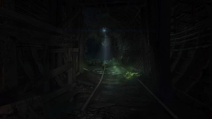
Tunnels, channels and alleys have their own unique design characteristics. Used in design from architecture to gardens, they have an uncomfortable quality, but they also encourage and force movement, channelling users towards a particular place, opening or, sometimes, reward. In the real world, long tunnels in buildings are teasingly lit at their end, lengthy pergolas, decorative and covered in plants, but are dark and atmospheric. Small archways in gardens provide moments of tension before pushing you on farther, sometimes to the reward of an open space, but sometimes to yet more uneasy spaces - a fear vs desire-to-continue balance occurring within the environment.
The combination of this balance and Metro's tunnels appeals directly to our survival instinct: in such tight spaces our overwhelming desire is to escape and put distance between us and any potential danger; any enemies introduced to such spaces add another wall, but one that encroaches, causing the space to get even closer with each step, ramping up the fear.
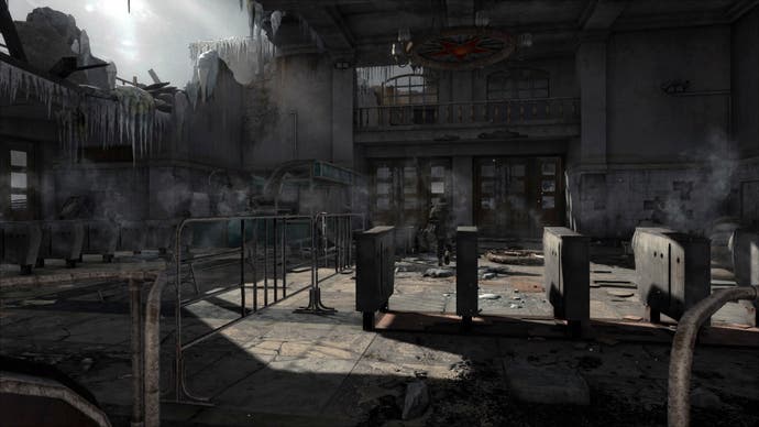
To alleviate the pressure. these tunnels will often burst open into open areas. In our world, this has been a technique for centuries, with even some Oxbridge colleges employing the method, drawing people down small dark portals or interconnected, windy passageways, then releasing them out onto large lawns or meadows or even ornamental groves. It can be an immensely refreshing sensation after such a claustrophobic approach.
In Metro, these occasional breaks into large spaces or the open-air provide an environmental break, but there is little respite - even the air wants to kill you. As if the claustrophobic environment wasn't uncomfortable enough on its own, the lack of breathable air causes extra anxiety - you have to rely on the same dangerous, unforgiving and uncaring landscape to produce gas mask filters to ensure you can make progress. There is an environmental irony in this sense of relief and alleviated pressure, turning promptly to desperation, yearning to return to the cramped tunnels as they are now the familiar setting - perhaps mirroring Artyom's relationship with the tunnels, having not known anything else and grown attached to that environment. It's a cruel punishment.
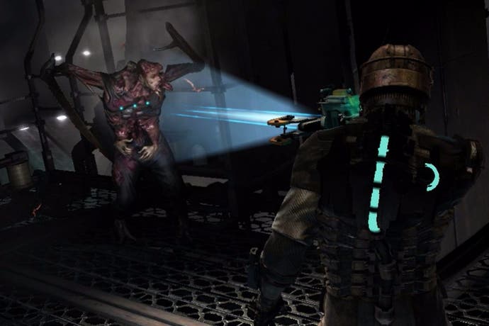
In the eerie USG Ishimura of Dead Space, there are both similarities and differences to the designs we see in Metro. Or rather, spatial and environmental design elements and approaches that are similar, but implemented and executed differently. Experiencing them in the third-person rather than the first means instead of feeling the environments, seeing the walls and ceilings enclosing Isaac lets us experience it at his human scale.
The Ishimura's futuristic and industrial aesthetic provides a clear and cohesive look and feel, and the materials impact on the spaces by making them unrelatable, increasing the anxiety felt through their design. This use of the unfamiliar in aesthetic to make spaces feel odd and tense happens regularly in our real-world. For example, by introducing different materials along outdoor pathways or internal corridors, gradually or abruptly, designers almost force the user to re-evaluate their steps and surroundings; they can feel something is different, with familiar spaces taking on a different character. Finishing the areas with a relentlessly similar colour scheme can exaggerate this effect, much like in a maze. Ishimura's corridors feel tight. It's as if the ship was another layer of Isaac's skin, heavy and burdensome. The elements of 'no escape', diminishing-to-crawling scale and space, and enemies constantly lining the spaces, only serve to highlight Isaac's vulnerability and under-preparedness for what lies ahead.
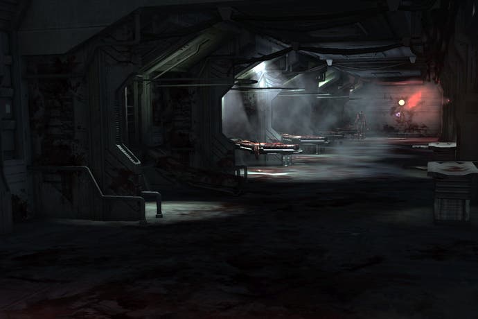
What Dead Space does differently is harness the power of light, shadow and darkness. It does this to great effect, enhancing the atmosphere and feel of areas. Weaving these into the composition of the spaces, rooms, corridors and halls is a subtle technique, but it has a powerful impact, enough to exaggerate, highlight and deepen feelings towards spaces: bright lights along thoroughfares and through cracks in doors draw us along, encourage progress but light potential danger spots; backlights combine with the industrial setting and materials to develop shade and shadow patterns to give spaces rhythm and build a tedious monotony into the very fabric of the ship, ramping up suspense with the frequency of their beats and making the same or similar spaces look and feel different depending on their light; and darkness, from corners of rooms to entire spaces, exaggerating the mystery and fear, that we, and Isaac, experience in these environments.
This use of darkness also causes open spaces to feel extremely close and claustrophobic. The ironic knock-on effect of this is we - and Isaac - are at our least claustrophobic and fearful when we are staring into danger and can see the necromorphs. This causes the removal of what would be the only areas of respite from the environment. Even here Isaac must feel confined and claustrophobic, the sense of tension and suspense never relenting.
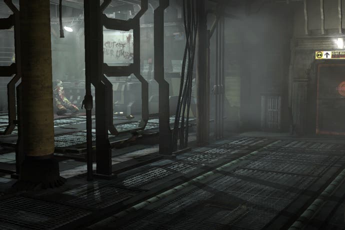
Bucking the feeling that claustrophobic video game spaces are a bit of a grind to work through are the sewers in The Last of Us, which manage to weave narrative and story into close and tense environment design. Naughty Dog's game makes it clear such environments should be scary and infected-friendly. It also marks distinct changes in the environment to emphasise tension, different atmospheres and also mix up the pacing of the narrative.
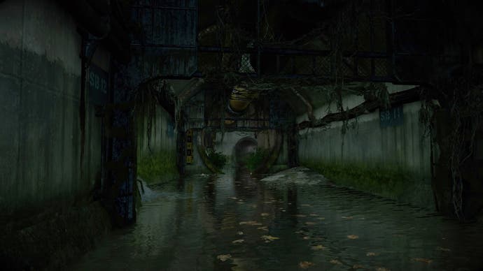
The sewers tunnels here are not too cramped or 'touching-your-head' close, and sometimes opening out once or twice to open air, but their twists and turns have a labyrinthine quality to them. The sweeping bends give the illusion of foreseeing danger and having clear sight, yet they are falling apart, hazardous and echo atmospherically.
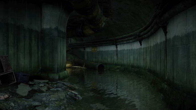
The tension and sadness is alleviated when Naughty Dog provides the player with a location that limits the directions from which danger can come. Using the environment to stay safe, and keep dangers in sight, is referred to as prospect and refuge: prospect where the space is a bit open and dangers are exposed, causing threat and vulnerability; and refuge, where humans use space to have safety at their backs and the more open areas in front of them.
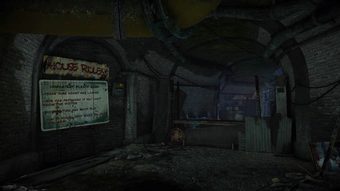
The beginning of The Elder Scrolls 4: Oblivion uses sewers and small spaces exceptionally well. It is a familiar setting for the start of a role-playing game, but the careful navigation that follows through dark and dingy tunnels expertly sets up the rest of the game. The relationship this cramped beginning has with the open world and expansive landscape nails the design technique of a grand reveal and sense of arrival.
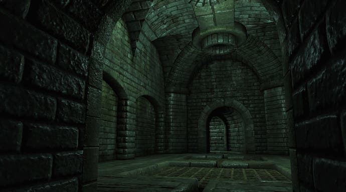
By engrossing the player in tight corners and a sneaky (at times) escape from the cramped sewers, caves and tunnels, Oblivion's landscape reveal is all the more breathtaking. The dank areas the player must meander puts a real distance between the original sighting of the open world - the panoramic, sweeping shots of the Imperial City in the introduction credits - and where you exit the sewers, and therefore gives Oblivion's caves and tunnels a special quality that makes us yearn to break out and explore.
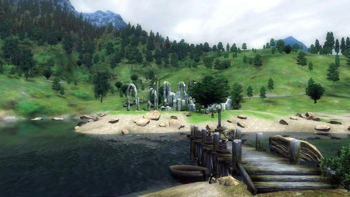
From relatively simple techniques such as tunnels and passages that build up to a grand reveal, to prospect refuge and maze designs, games have learnt much from real-life environment design. Couple this with clever use of shadow and light, and virtual close quarters can have eerie atmospheres that not only instil fear and trepidation, but also mystery and a sense of exploration.
