Skyrim: The Creation Kit Experience
Writing a brand new Elder Scroll.
My latest trip back to Skyrim didn't start with a dragon attack. It started with homework. Specifically, sitting down with a pen to watch a couple of hours worth of YouTube videos created by Bethesda, with the goal of transforming its Creation Kit from "Oh my god..." to "Oh, I see!"
Skyrim is a world I've spent many, many hours exploring, questing my way through, and burning fools with fireballs for my own amusement and sometimes justice. I tinkered a bit with the previous version in Fallout: New Vegas, but that game's world of radioactive dirt and cold metal simply has nothing on the epic sweeps of Tamriel's chilliest corner. This is a land of magic and monsters. I'm already its saviour. Did I have what it took to be its master?
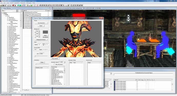
Make no mistake, the Creation Kit is amazing - but it's also incredibly intimidating. It's the same tool that Bethesda itself used to create Skyrim (at least, officially - there's always a chance it just pressed a big red 'Make Game' button and this is all a big ruse) and opening it up is to see the whole thing laid out in front of you. Every map. Every object. Every quest. Every marker. It's all there to be played with, and in case you haven't noticed, Skyrim is a pretty big game.
The good news is that nothing you do in Creation Kit can break the main game - at least, not permanently. The master data file is locked down and you don't get to mess with it. Instead, you create mods that are added onto the top and can be switched on or off individually, stacking them up to create whatever Skyrim experience you want. There are over 4000 of them on the Steam Workshop, with others lurking elsewhere if you'd rather do naughty things like removing Lydia's clothes instead of just her catchphrase. No, no link. Ask Google if you must.
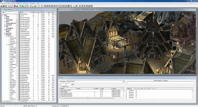
Most mods so far are relatively small scale - gameplay and world tweaks rather than new quests and areas. There are some very impressive ones though, including Open Cities, which makes the major cities part of the full overworld map rather than their own isolated zones, Midas Magic for mages bored with casting the same handful of spells all the time, and Improved Interior Lighting for improved interior lighting. You probably guessed that. There was a clue in the name.
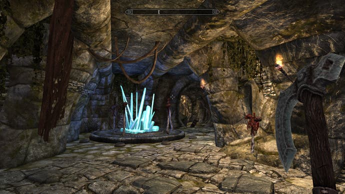
The downside of Creation's power is that it's easy to get carried away with the possibilities, as when I sat down to create my debut magnum opus - the epic total conversion 'Azeroth vs. Middle Earth: A Ninja's Love Story.' Needless to say, what I ended up with was more on the lines of 'A Really Quite Nice Cave, Even If I Do Say So Myself.' At least it was a cave with no bloody giant spiders in it, making me both a better level designer and human being than whichever arachnophobe hating sadist created Skyrim's tutorial dungeon.
Approached cold, Creation Kit is an unusual tool - often finicky, but surprisingly forgiving. Creating an indoor area for instance, like a cave or a house, is simply a question of clicking together prebuilt blocks. There are several packs of these available, each broken into specific pieces like walls, corner pieces and doorways designed to fit perfectly against each other.
I eagerly set to work with the standard Nordic kit, splashed down lots of corridors and a couple of chambers, eagerly fired up the game and... I was instantly bored to tears. The Really Quite Nice Cave (Beta 0.1, join the mailing list!) was nothing but a time machine that sent my mind reeling back to the original Dungeon Master. Flat rooms. Walls. 90 degree angles. Zzzz...
How did Bethesda use these tools to create the actual game's intricately crafted interiors? The secret is that as sterile as Creation Kit looks, it's happy for you to be messy. It doesn't care for example if, say, you put a rock through a wall to make it look more interesting.
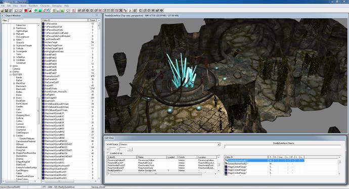
It shrugs off gaping holes in the side of the world, and leaves it up to you to worry about two corridor pieces not fitting perfectly over in the corners. Obviously, unfixed that kind of thing looks terrible, but the repair job can be anything from painstaking object nudging to just sticking a bolder in front of the gap so the player doesn't see it. This is the kind of laziness I can get behind.
With this knowledge and some virtual sticky-tape in hand, making stuff in Creation Kit became much more enjoyable. I'm not good at working in 3D - the three-panel view of the average FPS or 3D editor sends shivers of horror down my spine, and not in a good way.
Skyrim's dungeon editing is closer to interior decorating though, with everything from tables to fire mages in a big catalogue, waiting to be drag and dropped into your simple shell until it becomes a world. Placing everything does involve many tiny icons and important hotkeys, but the basics are easily picked up. I doubted I'd be making the Really Quite Nice Cave the latest flashpoint in the civil war between Imperials and Stormcloaks any time soon, but adding a pillar here and a treasure chest there, I soon felt everything start to come together.
Something was missing though, and I soon realised what. Purpose. Every great dungeon needs to be more than the sum of its parts. So did mine. They need a sense of history, of adventure... of myth and Myth 2, Oni and Halo. Looking at what I had so far, I quickly worked out the epic backstory that would guide both the rest of my design, and the player's path to glory.
"Once upon a time there was a Very Nice Cave," it began, as if scribed into legend by Crassius Curio himself. "And it was very nice indeed. Also there was treasure in it, which nobody had dared claim because they thought there was a dragon there too. But that turned out to be a lie because dragons look seriously tricky, so really it's just a bored Draugr or something."
That'll do, I thought. Then, thinking more pragmatically, I added "Visitors occasionally claimed to have seen a void between worlds through occasional cracks in the walls," on the grounds that if that kind of shameless cheating was good enough for amateur creators of Hall of Mirrors effect filled Doom levels back in 1993, then dammit, it's good enough for Skyrim in 2012!
The trickiest part about getting even this far is learning to decode Bethesda's naming conventions. Many of the pieces you get to play with stand alone - rocks, doors, pillars and so on. Room pieces though, which make up the general shell of each area before you mess around and make them look interesting, are intended for use in very specific ways. Many only work one way around or in specific situations, all identified with codes like "ImpLRRoomWall01" or "ImpLRoomLCorner02". It's not tough to work out what they mean, but finding the right pieces can be fiddly - especially when it comes to making transitions and less boxy rooms.
Any mistakes are easily fixed. You can swap out pieces for others while leaving them in place, and view the map from any angle to see any holes in the architecture or bits that don't quite match. Lining things up is easy with snap-to-grid switched on, but you can do it by hand if you want a specific effect (like creating a transition between two area types or floating a few rocks and dirt patches through the floor to make it good and rough).
A quick tap of a key returns you to an overhead view, selecting any piece jumps you right back to it in the render window if you get lost, and there are shortcuts on hand for everything you might want to do. Need to place an item on a table for instance? Hold Z to only affect one axis and drag it up or down. You can even opt to scatter a bit of this kind of 'clutter' using the Havok physics engine, or freeze it in stasis until the player actively wanders over to mess with it/stash it in their adventuring pants.
As everyone knows, the first level you make in any game is your license to do whatever you like, from writing your initials in rocks by the front door to dumping all the best weapons and quest items into a chest and giving yourself the key. In this case, I refrained - not so much on principle, but that the first sounded fiddly, and the latter pointless. I play a mage, and haven't had any reason to change out of my now probably very stinky Destruction boosting robes since single-handedly annihilating the Thalmor for being a bunch of complete dicks.
Instead, I went on a tour through some of the other kits to see what I could pinch - ultimately heading over to Azura's domain to swipe some of her cool looking crystals and crystalline AzuraFloorHex pieces for decoration. Sure, Noclip out of the level and you'll see them stretching through empty space, but who cares? From inside, they look incredibly cool - at least, compared to an empty cave without demonic honeycombs glittering in the light. I'm not sure how canonically appropriate this is, but luckily I do know that I don't care.
I'm not exactly about to send Bethesda a copy of The Really Quite Nice Cave as an audition piece, or even add it to the Steam Workshop. As a general rule, you should never show anyone your first piece of work in any field, unless explaining why you want to borrow the necessary firelighting equipment to hide the shame. For an evening's light playing around though, I think it came out quite nicely. The sheer quality of Skyrim's assets make it spectacularly easy to create something that looks good, and it's the work of seconds to hook up a door in the world to both warp you to your new area and fully integrate your creation into Tamriel proper.
Check out the Creation Kit wiki for everything you need to get started. Along with the excellent video tutorials (a ten part series, starting here) you'll find a breakdown of every button in the editor, every major game system, and a comprehensive tutorial that goes from creating your first room to making it part of an official quest, to applying a little Radiant magic. You won't be creating epics in an evening, but there's no reason anyone can't at least put your own mark on Bethesda's amazing world.


