Settling the Stores: The PlayStation Store Makeover
The PS Store's getting a makeover on PS3. What can we expect?
When I first heard that the PlayStation Store for PS3 was getting a proper reworking, I performed a short and spontaneous dance of joy. Collateral damage: a time-worn and much-loved Billy bookcase, which I'll probably end up blaming on the cat, or a rogue earthquake.
I also fired off a quick non-NDA-voiding email to a friend of mine who works in usability testing. Dr Graham McAllister runs a consultancy firm called Player Research, and is on record as being no friend of the old store design. I asked him, apropos of nothing, right, what he most disliked about it.
He and a couple of colleagues sent me back quite a long email, the gist of which was that they enjoyed neither browsing nor hunting for specific things on the current set-up. There's no easy way to filter by price, which is always important when you're, you know, shopping, and finding add-ons is particularly nightmarish. Beyond that, they described the search function as "an antique", with no proviso for spelling errors. (I'm not sure I've spelled proviso properly, come to think of it, and I've almost certainly used it incorrectly.)
Anyway: not fans, and I don't really enjoy my time there very much, either - even if I do like the frosty tile-clicking sound effects. Good news: the new version - which will be available on 17th October - is much better. And it tackles all of the main points Player Research raised, too.
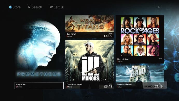
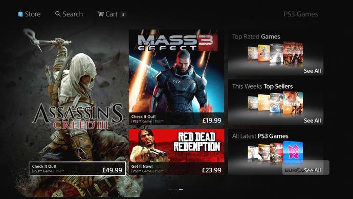
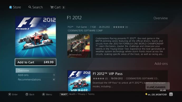
Sitting through a demo at Sony's London HQ, the new store's clean and elegant. The blue background has been replaced with a kind of smoked glass grey, and the font is bold and non-fancy and owned by Sony itself apparently, even if everyone had temporarily forgotten what it was called when I asked. Tiles are gone, and there are huge Microsoft Metro-styled pictures for the main content instead, and that stuff takes up roughly three quarters of the screen, I'd say. I'll get to that bit in a minute, though. The important part of the redesign is found running down the left hand side.
"Tiles are gone, and there are huge Microsoft Metro-styled pictures for the main content instead, and that stuff takes up roughly three quarters of the screen."
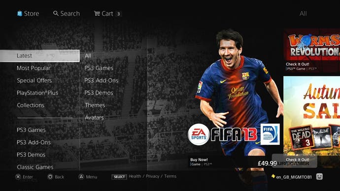
Load up the store, and the left side of the screen shows you What's New, divided neatly into Games, Movies, and TV. That movies and TV are getting such high billing is itself pretty interesting, I guess, but what's far more pertinent is what happens when you click on a section.
Click on Games - don't worry, no mouse pointer, you're just moving the highlight around - and you get an above-the-line and below-the-line set-up. The above-the-line stuff is all featured content: New, PS Plus, Top Sellers, and that kind of thing. Below the line you get the standard categories: PS3 Games, Demos, Add-Ons, Classics.
Drop into a category like PS3 Games, and you can finally sort and filter properly. Filtering allows you to pick between categories like Game Type, Price, Play Type - i.e. online multiplayer - and Release Dates, and even which accessories it uses. Sorting, meanwhile, allows you to order your results based on the alphabet, what's newest, and that manner of jazz. Within seconds of using the new system, you can find the newest multiplayer-only games released on PS3. You don't have to browse any horrible A-Z category tiles.
"And what of good old Search? Completely overhauled."
And what of good old Search? Completely overhauled. The onscreen keyboard has been dialled back, and instead you get a column with all the letters in the alphabet, a bit like with the 360. It searches the whole word - MAS returns Mass Effect just above Tiger Woods: The Masters - and it can cope with spelling mistakes and abbreviations. It will bring up Modern Warfare 3 if you search for "MW 3". Selections all have clear tags, too, listing whether you're looking at a game or a movie, and while you can hunt directly for an add-on item by name, if you search for Mass Effect it will give you the parent product - the game - first. Search results are also divided by above- and below-the-line returns, too, ordered by popularity. Mass Effect is up top, for example, while Batman: Mask of the Phantasm is below, even though nobody wanted the ending of that changed post-release, did they? It's a nice way of presenting the full catalogue without overloading people, and it also reminds me of the good old days of the newspaper biz, when we all wanted our pictures above the fold, unless we'd been caught shoplifting.
The system's surprisingly smart in places, too. Take Add-Ons. Search for Call of Duty: Black Ops - Rezurrection, and it takes you to it, but the page also throws in a link to Call of Duty: Black Ops itself. Click on that, and you'll see that every parent product has a page that arranges the key child (?) products around it: it becomes sort of a portal for everything that it's related to. There are screenshots and even streaming trailers, when a publisher's provided them, and the bottom of the page always allows you to go back to the last spot you visited, while the top always shows you a search box and your cart.
So what about the other three quarters of the screen when you aren't tucked away in a specific product? This generally displays games (or movies or TV), via huge, poster-type panels. It's a carousel set-up, and each page has a "hero" title, with a character who moves in parallax as you scroll. On the FIFA page, it's Messi, for example. It's not messy, though: it's definitely rather Metro-ish (I know Microsoft can't call it that anymore, but old habits die hard), yet it's a lot more orderly that the 360's front end. On that note, I asked if they're going to be selling ads, and got a "no comment".
Vita and PSP content is included in search but always clearly marked, incidentally, and there are currently no announcements about rolling out the new design to the Vita itself. It's interesting that a redesign comes at this point in the life of the PS3, really. Is it a hint of what we can expect for its replacement? "It's more of a reflection of where we are now and where we want to develop the PS3," says Gordon Thornton, vice president of SNEE (Sony Network Entertainment Europe) Network Operations. "I'd characterise it another way," suggests Elliott Dumville, the game store development manager. "It's an evolutionary process as much as technology is concerned, but part of that evolution is us wanting to understand our fans and our consumers better. What we're trying to deliver on here is an experience that reflects that. That ultimately will be what drives the features you'll see over the coming months as much as anything else."
"Vita and PSP content is included in search but always clearly marked, incidentally, and there are currently no announcements about rolling out the new design to the Vita itself."
Ask if the team's learned much from other platform holders, and Thornton thinks for a few seconds. "From our perspective, we reference everything that's going on in eCommerce, and we can learn from everyone, not just the games market. We develop ideas and from those ideas we explore them with the gamers and consumers. They tell us whether we've got it right or wrong." "That's a crucial point," says Dumville. "Everyone is trying to solve the same kind of problems, but each ecosystem is different. We have a sense of PlayStation values that we want to be true to, and we need to deliver on that as well as solving interface issues."
It's hard to get that excited about a new online retail front end, perhaps, but the new PlayStation Store seems smarter and more usable than the old option, and it's pleasantly unfussy with it. Gone are the nasty tiles and alphabetical lists to page through, and while it's undoubtedly learned a lot of its tricks from Xbox Live, it still feels - in some weird, smoky-glassed way - like Sony.
