Tiger Woods PGA Tour
From quality golf to the other side of a gulf in quality?

Reviewing launch titles on a new console is a difficult process. There are lots of reasons for this, but one of the main problems is moving goal posts and working out what it's actually reasonable to expect. Half the time with a new console we're struggling to work out what the sport is, let alone where the goal posts have scampered off to - the only basis for comparison being games on other consoles. [Note to reader: see how Tom flagrantly ignores the convention of Golf games not having goal posts, and then gives them legs. A good start. -Ed]
Tiger Woods PGA Tour on the DS is certainly easy to compare to previous versions on PS2, Xbox et al. It's a bit harder to control; it looks a bit ropier because the DS, unsurprisingly, can't out-muscle an Xbox whilst projecting frivolities onto the second screen; and it's home to far less content than we've come to expect. But is that demonstrative of a game that isn't doing enough, or is it simply what's possible?
Either way, I know how much I like playing it - and that's quite a lot, but not quite enough. Tiger Woods is a game I'd love to recommend. I've spent many hours happily toiling my way through Pebble Beach, Kapalua, TPC at Sawgrass and other golfing haunts familiar to fans of the series. The DS version can be commended for making an effort, scattering the statistical info over both screens to avoid clutter; bravely adapting the analogue control system to work with a stylus rather than opting for the two or three-tap system used by the likes of Everybody's Golf on PSP and Mario Golf; and using the DS's Sleep function to restart interrupted round at the most recent hole you were playing. But the worry is that it's so simple after a while that it might well send you to sleep anyway. And when it isn't incredibly straightforward, the frustration is more down to the design than your own skills.

But let's deal with how it works first. For the DS version of Tiger Woods, EA has had to design a new control mechanic to make up for the loss of the analogue stick that's become so pivotal - ha! - to our enjoyment of the proper versions. The analogue control allowed for greater precision than tap-tap-tap ever seemed to and remains very popular. EA clearly wanted a replacement closer to that than anything else, and the solution is a U-shaped swing meter that relies on using the stylus to draw the stroke, emulating all the functions of its analogue cousin as best it can.
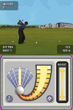
The idea is that you draw your stylus down the right side curving in to the middle and then draw it back up the left-hand side in one movement. Your choice of starting point for the downward stroke and your ability to draw within the lines of the meter determine pace, while your upward stroke's divergence from the centre governs the degree of pull or slice. You can also boost your shot's power by rubbing up and down on a Boost strip, and then in flight you can add spin by making rapid directional strokes on a ball icon - all the while your ball's trajectory is charted by a 3D view of the game on the top screen and an 2D overhead view on the bottom.
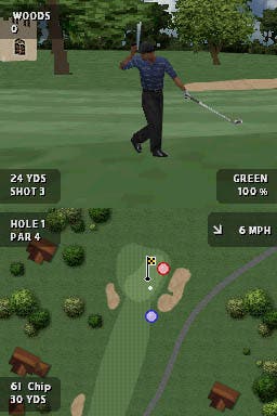
Graphically, Tiger's top screen 3D output is somewhere around PSone level with a surprising amount of course-side detail. Character models, objects and course shape are understandably less detailed than we've come to expect, and the animations could do with a bit of a work to clear up the odd frame-skip, but on the whole it's a handsome enough rendition. The simpler 2D view, meanwhile, is just about right; its simple lines and choice of colours clearly showing you what and where everything is.
Vital information is distributed evenly across both screens. Clockwise from top left: on the top screen we have name and score, dollar total for the round, hole info (yardage, shot number) and your shot's positioning (along with the percentage of the shot possible from that lie, e.g. "Tee, 100 per cent"). On the bottom, there's more course info (e.g. Hole 1, Par 4), wind speed and direction, club selection and potential yardage.

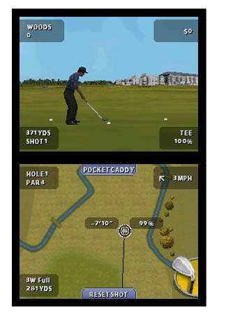
Some of it's probably extraneous or unhelpfully placed (wind speed perhaps ought to be on top so you can actually see it when you've switched the bottom screen over to the shot meter, instead of just allowing it to become obscured), but you instinctively know where to look after a while. You can also use the bottom screen to position the shot cursor, which shows where you're aiming. Moving the cursor sees the top screen zoom in on it and follow it around, which allows for more precision and a better idea of where the ball is going. The cursor also has a little box next to it noting the elevation and how much of your chosen club's swing it would take to reach the cursor in one go. 75 per cent and you may have to hold back. 125 per cent and you ought to go shopping instead.
The bottom screen also gives you access to a Reset Shot command and the Pocket Caddy screen. Pocket Caddy gives you more detailed hole and course information, including a basic strategy for approaching the green, and it's also here that you pick club and shot type if you're not comfortable with the suggested selection. You can also use the shoulder buttons to switch clubs quickly. The Pocket Caddy element is activated by a button at the top of the lower screen although, after a few rounds of accidentally tapping it when you're repositioning the shot cursor, you'll wish you could turn off the button and just hit X instead.
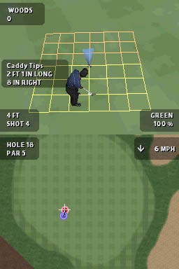
In any event, that's what you have at your disposal away from the green. Once you get onto the finer stuff, the putting mechanic remains much the same as it is on the big consoles. Like those versions, the putting is effectively digital here with no shot meter to speak of. Instead, the idea is to use Caddy Tips and a yellow grid overlaid around the hole to work out where to aim, and then hit A or tap the shot icon to play that stroke. Surface variations then play on the ball as they would, and if you managed to follow your Caddy's instructions to a T, you'll be off to the next, er, tee - with nary a two-putt. It's slightly harder than it used to be on the green, but that has more to do with the lower levels of detail. Indeed, you're now utterly dependent on the Caddy Tips, and the challenge is judging them against guide lines, which don't correspond to the feet and inches you're being quoted.
After a period of adjustment, Tiger Woods on the DS comes pretty easily. But it doesn't know how to be hard. You really can't get anywhere on the green without Caddy Tips, and when they're "Unavailable" - which happens far more than it did in previous versions - you're basically left to hit and hope that you'll end up close enough for the Caddy next time. But that's only a small part of it. I could moan about the prosaic thwack sounds and canned applause that make up the audio, the lack of feedback on your swing, the occasional slowdown on the green as the game works on your Caddy Tip and the 3D view chokes on the computations, that chipping remains a black art, and that you can't add as much spin in the same amount of time as before. But they're minor issues too, and you can work to them without spoiling your round.

The big problem is that EA has been forced to reinvent a wheel it had already reinvented, and the result feels like driving a cart made out of octagonal trees [hey, Flintstones Golf! -Ed].
Pointing this out feels, to morph an existing cliché, guilt-edged. EA really had no choice but to try something new. Realistically, if Tiger Woods DS was a tap-tap-tapper, reviewers would all be complaining that it didn't try to make use of the stylus instead. Heck I'd feel bad about sitting here and complaining that there should be an option for tap-tap-tapping. But in the end you're eyeing up where to spend your money on a scale of entertainment, not effort or noble intentions, so it's my job to be unhappily downbeat. So, best reviewer voice on: it's nice that someone made an effort, but then they got the Millennium Dome working in time for December 31st, didn't they? Badumtishtearsofdisappointment.
And, actually, I could probably do away with some of the guilt. Some of this is definitely EA's own fault.
The swing meter isn't as intuitive as the analogue stick system because it can't be. But why it fudges your choice of starting point to a notch lower or higher than desired is another matter. We know the DS stylus is a precise little tool because games like Zoo Keeper and Polarium prove it can be. When the tip hits the screen inside the bounds of a small box on a swing meter, the game ought to be able to tell exactly where it hit without this margin of error. And if there is some trick to the speed or angle of your swing that stops the game punishing you with half-power shots, then it isn't advertising it.
You know, I was watching Blake's 7 last night. "There are other rules, but you'll find out what they are when you break them." Yeah cheers. I always seemed to break Tiger's when I needed to land a shot on an elevated green in the middle of a big lake. During a finely balanced Stroke Play game just so the damage is really terminal. Rough, swing, splash. Rough, swing, splash. Pause, exit, oh-I'm-sure.

Another issue is that it's surprisingly light on content for a Tiger Woods game. You've got six courses, eight pro golfers and three game types - Stroke, Match and Skins - but that's it. The two game modes are Quick Play and Legends Tour. Quick Play allows you to choose a game type and one of the unlocked courses and then play front nine, back nine, full 18 or whatever takes your fancy - with choice of tee and the like adjustable in the options menu. Legends Tour gives you a long sequence of challenges that involve one of the six courses, one of the rule sets, and one of the real life golfers (including Justin Rose, Vijay Singh and Tiger Woods, obviously). So it's like a Randomiser for Quick Play, except it also has something of a difficulty curve to it - even if the curve generally has more to do with the game and course design than the skill level of your opponent.
In practice this will last you a long time. Many hours in fact. But there are virtually none of the distractions and little frilly touches that have become so central to Tiger's success elsewhere. There are no Real-Time Challenges (you could've had real-time multiplay challenges! Where you had to run over to the other side of the office at lunchtime on a specific day to play! Gah), there's no Speed Golf (no running over to the other side of the office at lunchtime as fast as you can), and the need for multiple game cards for the four-player wirelessly is needlessly prohibitive (no running over to the other side of the office whatsoever). To top it off, the entire reward structure seems to have given up and gone back to the 19th Hole for a pint; Trophy Balls are gone, leaving nothing for the hardcore to lust after, while the Pro Shop (and virtually all the other customisation options) are absent too, leaving EA's newfound army of bling-core fans to mope about trying to staple neon lights and spinning hubcabs to their balls for real instead.
Tiger Woods PGA Tour, then. DS owners who want a golf game and don't want a PSP will probably have to wait a while for a better offer, and will find there's plenty to this in the meantime - even though it doesn't live up to the series' lofty status elsewhere. PSP followers will probably do better with Everybody's Golf. In the end, it's a golf game fundamentally redesigned to its detriment, shorn of many of the little things that made up the rest of its appeal, and now merely flawed but enjoyable.
Reviewing launch titles on a new console is a difficult process. But it doesn't matter where the goal posts have scampered off to if the shot's off target.

