QUBE Review
Too much cake.
QUBE means 'Quick Understanding of Block Extrusion'. Doesn't exactly trip off the tongue, does it? But QUBE is more elegant than its name suggests, a slow-paced and methodical first-person puzzler that only suffers from an obvious comparison - one that, unfortunately, it forces on the player again and again.
The aesthetic design of QUBE is far too inspired by Portal. The game doesn't share a great deal of its mechanics or ideas, but the influence is absolutely overbearing, to the extent this almost plays like a pitch document. The problem is not that Toxic Games wants to be hired by Valve - that is a noble and understandable aim, and by the way Gabe Newell if you're reading I'm available - but that QUBE's is visually a poor imitation of Portal, and so your frame of reference for its decent FPS puzzling is the best FPS puzzler ever. Every moment feels intruded upon (Gabe, call me!), and the comparison does QUBE's own mechanics no favours. (GABE!)
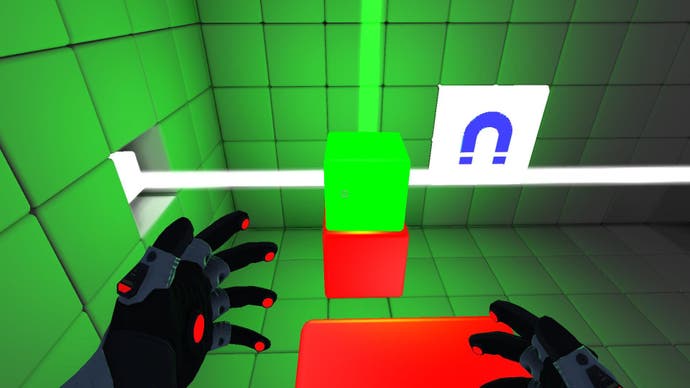
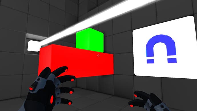
You wake in a lab, a silent protagonist wearing high-tech gloves. The floors and walls of its small rooms are composed from large grey and white tiles, the interactive elements are colour-coded, and the larger structure funnels you through increasingly complex arrangements of blocks and jumps. Puzzles are built around coloured bricks that react in different ways to a wave of your glove: red ones pull out in a straight line, yellows are in groups of three that pop out to different lengths depending on where they're hit, blues act like springs, and purples spin sections of the walls.

The game's first stretch is made up of reds, yellows and blues - simple puzzles where you pull out reds to build ramps up to a ledge, work out how to make the yellows emerge in the right pattern, and bounce off springs towards newly-made footholds. The first hour or so of QUBE combines these into larger multi-part puzzles, but this is a sedate stroll rather than a challenge.
I don't think Portal's challenging until the latter stages either, but the difference there is the fun inherent in using portals; even when you're solving a relatively simple challenge, the way you're doing it is a little thrill every time. In contrast QUBE's central mechanic is a hand pointing at blocks which then move, or pointing at magnets, or pointing to turn a lens. It feels like you're controlling things at one remove, and even when the setups incorporate giant spring-boosted jumps or mid-air block-surfing there's little physical feedback from your avatar's actions.
Despite that, QUBE wrings enough ideas from its basics to keep your interest, and regularly adds more tools - magnets, lasers, power wires, pulleys. There are puzzles that work like miniature mazes, where you're prodding a ball back and forth beneath your feet until it slots into the right spot, or great room-spanning layouts that have to be reconfigured completely to escape. As the game hits its stride, slopes are introduced alongside glowing green spheres and many later puzzles are built around buffeting the ball in the right way as it descends: knocking it to the side, 'catching' it with a block, guiding it towards a hole.

These slope puzzles show the best and worst of QUBE. Many are beautifully arranged, with elegant solutions you'll only stumble across after much clumsy fiddling, and demand multitasking under pressure. But the deliberately weird physics undercut everything. The balls have curiously unsatisfying properties that don't seem to reflect the shape: they stick to walls, wobble at strange moments, and sometimes gravitate towards their destination in a manner reminiscent of crazy golf. It's not that they're difficult to use in solving the puzzles, but that they almost seem to help you too much - where 'realistic' physics might result in an inconvenient bounce, QUBE's take is that the ball somehow shonkily rights itself. It's a persistent niggle.
At least that's a creative solution. QUBE has an entire section where the puzzles are relatively simple but the challenge comes from... turning off the lights! LOL at dumb players and their reliance on vision! I've always nurtured a hatred of invisible enemies, and this is basically the puzzle equivalent - you're in a room that's entirely dark apart from the blocks you can affect, which glow. It would be nice to say that this is all about mental reconstruction of a physical space, but the truth is it's a boring stretch of trial-and-error. And also, you can't help thinking, a hell of a way to build a level with the minimum of assets.
The production values of QUBE aren't the problem - it's clearly a game made by a small team, but the technical performance is fine. Others may be able to overlook the style to enjoy the puzzles beneath, but the Portal comparison is overbearing. Portal environments feel like expensively constructed testing labs that could in some twisted world exist, whereas QUBE has the general appearance of this but can't reproduce the detail and imagination, and despite the nature of its puzzles the rooms tend towards banal shapes with exits rather than architecture.

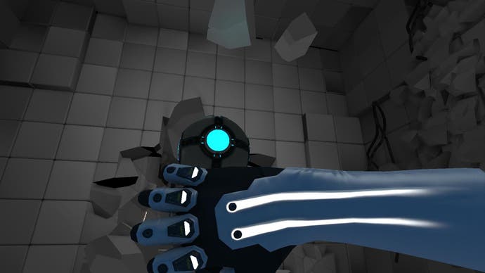
It's bare. When QUBE's narrative takes over in the second half, the sheer lack of fresh ideas becomes painful. Would you believe that the testing chambers start collapsing, revealing the machinery behind the pristine surfaces?
QUBE is a half-familiar and strange game, but that does not make it a good one. Its ideas for first-person puzzling mechanics are original, and when it starts combining them all into larger and more baffling setups it has great moments with a chilled-out pacing all their own. But that creativity is smothered under slavish imitation of the aesthetics and structure of the Portal series, and such a large influence is malign. QUBE hasn't learned from Valve's game but copied it - and ends up a shonky paraphrase of much better science.

