NGP Hands On
So does it do everything?
So much for pocket gaming. The first thing that strikes you about Sony's NGP (a name whose days are numbered, with a sexier and more practical alternative likely to be unveiled at E3) is its size. Larger by some measure than its competition, the NGP's closest comparison in handheld history is Atari's Lynx.
That's an association Sony would likely prefer to avoid, along with the more obvious point of reference: Apple's iPad. The NGP's 5-inch OLED screen certainly holds its own against that particular device. And while the 960 x 544 display doesn't pop quite like the iPhone 4's Retina display, it's a world away from its dedicated gaming opposition in terms of resolution.
The 24-bit colour is deep and rich and the screen's size excuses the NGP's unwieldy proportions, seeing as much of its surface is given over to the display. It may lack the stereoscopic fireworks of the 3DS but it's shiny enough for you not to care. Besides, the NGP has a fair few gimmicks of its own.
The handheld's touch screen and touch pad both work with the same fidelity as Apple's offering, and the OLED display remains unblemished even after suffering the sweaty pokes and swipes so many NGP games demand.
The rear pad is inconspicuous to the point of anonymity and slightly awkward to use. It does offer some interesting options for developers, as hinted at by the early software line-up. It's certainly the most intriguing of all the NGP's features.
These of course include those long-awaited dual analogue sticks. They feel disconcertingly small at first, their convex nature allowing blundering thumbs to slip off them all too easily. They can also seem a little light and insignificant, and there's an initial concern they won't offer the resistance required by precision shooters.
However, those concerns are neatly washed away by five minutes of duck and cover in Uncharted: Golden Abyss. With a little calibration of expectations, the analogue sticks are unlikely to disappoint.
What's interesting is how they will play to the more traditional console experiences expected on the NGP. The planned Call of Duty will really put them to the test, but for now it's a challenge Uncharted has no trouble in rising to.
The NGP's own layout will never feel as comfortable as a DualShock – the size of the thing and the contortions it occasionally demands make sure of that. All the same, it's certainly a cordial host for third-person shooters.
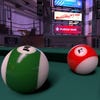
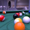
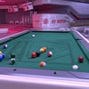
That Sony's NGP can play host to the kinds of experiences we'd expect from PlayStation 3 is no longer in question. Any lingering doubts are extinguished not only by Uncharted but also wipEout, which runs side-by-side with its PS3 brethren and comes off favourably.
The real question is whether people want that experience from a handheld, especially in light of a market which is unrecognisable compared to the one PSP launched in six years ago. There's no word yet on how Sony will sate the growing appetite for bite-sized games or how the PlayStation Minis might adapt, but at least the more leftfield games on show give a hint of what to expect.
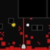
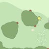
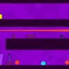
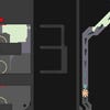
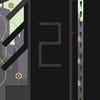
If Sound Shapes (as it's temporarily titled) is anything to go by, the NGP will foster come creative gems which make the most of the handheld's own idiosyncrasies. The work of Riff: Everyday Shooter's Jonathan Mak, the game continues the synaesthetic concerns of its PlayStation Network predecessor, this time transposing rhythmic abstraction to the platform genre.
Levels are comprised of pulsating backdrops drawn from stark lines and flat colours. Each object on-screen corresponds to an instrument featured on the game's minimalist soundtrack. It plays out like Rolando by way of Mondrian, the player tasked with moving a throbbing blob from one end of a single-screen level to another. The game's real charm, though, comes through its use of music.
In Sound Shapes each screen is an interactive music sheet. Pitch is defined by the placement of enemies and platforms. This makes for plenty of fun when exploring the developer's own creations, but the real brilliance lies in the user-generated content elements.
Here the front touch screen comes into its own. It provides a swift and natural interface for using a simple suite of tools. The end result is equal parts level creator and music maker.
