Grand Theft Auto IV: PS3 vs. Xbox 360 Special
Including high-def video split down the centre.
Resolution, Textures and Anti-Aliasing
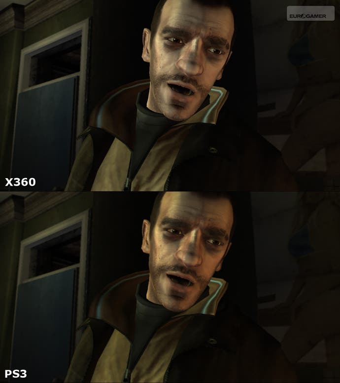
Here's where things start to get interesting, where the two games really start to diverge. GTA IV has a different look on each machine, dictated by both technical limitations and - apparently - Rockstar's vision for the game.
First things first. Xbox 360 runs at full 720p (1280x720), whereas the PlayStation 3 code takes a 20 per cent hit, being natively rendered at 1152x640 before being software-upscaled. Regular readers of the face-off features know that this approach can work well (check out the comparison gallery for Dark Sector in the last face-off) but in most cases, the PS3 port just tends to look like a blurrier version of the original Xbox code: not impressive considering that typically, PS3 hardware - and sometimes software - is more expensive.
GTA IV is a kind of weird combination of the two. Both versions feature heavily post-processed visuals, in particular when it comes to depth-of-field effects. Objects in the distance on both versions are blurred in an effort to match the natural focus of the human eye. Where post-processed blur meets the upscaling effect of PlayStation 3, the result usually looks very good indeed - a little softer, of course, but rarely distracting. A slight change of hue (particularly noticeable on indoor cut-scenes) also makes the PS3 version look slightly warmer.

Technically speaking, Xbox 360 really should be winning this contest hands-down, but bizarrely, it doesn't. There's support for proper hardware-assisted anti-aliasing, eliminating a great deal of the jagginess of the PlayStation 3 version, plus it's running at full-fat 720p. However, Rockstar has introduced a 360-specific post-processing effect that dithers just about every texture on-screen. It's an effect not present at all on the PS3 version and serves to introduce an oil-painting-like effect to the overall look of the game, particularly on background objects. Unfortunately, it also seems to actively distort the edges of detail in the textures and occasionally looks really ugly.
As it is then, both versions of the game have their strengths and weakness. Ask anyone which look they prefer when presented with comparison shots and you'll find that opinion is divided pretty much straight down the middle. Even Rockstar VP and GTA IV co-writer Sam Houser stepped into the debate, telling 1UP that the 360 version had a "more clinical element" while the PS3 game has "a certain kind of softness without being blurry... [with] some warmth to it". I can see why PS3 would be more appealing to some. The upscale and resultant blur helps to make the game look a touch more movie-like; less rendered and less 'gamey' if you will - a good combination for a mainstream audience.
What is curious to me is that I can see no technical reason why the 360 game shouldn't just be a more detailed, smoother version of the PS3 version. Indeed, if the texture-dither filter could be turned off with a selectable option in a forthcoming patch, I'm almost certain that it would be the superior-looking game simply by virtue of the extra resolution and edge-filtering. But as it is, right now, there's not much in it.
As it is then, it comes down to personal preference, and in my view, Xbox 360 just 'edges' it. It seems that Rockstar didn't appear to issue a single PS3 screenshot pre-launch, which indicates that in-house the 360 game was the lead platform, and obviously the one chosen to best serve the PR effort. Anyone who's ever worked in the games business will know how carefully Rockstar controls its assets, so choosing 360 was a conscious decision. As an aside, it does seem quite ironic that in most cases, the PlayStation press would've been running previews and even reviews with Xbox 360 screenshots.
Regardless, away with such small talk and on with the video.
Alternatively, get the full picture with our 720p gallery of resolutions and anti-aliasing comparison shots.


