What works and what doesn't in Forspoken on PS5
The DF Tech review.
In 2012, Square-Enix unveiled a tech demo designed to showcase what the then next-generation of consoles might be able to deliver from a visual perspective. The demo was called Agni's Philosophy and it was our first taste of the Luminous Engine which would go on to power the gorgeous Final Fantasy 15. A second demo, known as Witch Chapter 0, was created and shown three years later, focusing on the same lead character while expanding its technology. Now, more than ten years later, this convergence of technology and world building come together in a shipping game: Forspoken. Powered by Luminous Engine and inspired by the world of Agni's Philosophy, Forspoken channels a different era of Square-Enix, when new concepts flowed freely, bound not by the Finality of its most popular Fantasy series. In that sense, Forspoken melds Japanese design with Western sensibilities to create a unique fusion.
Developed by Luminous Productions - including many of the same people that worked on Final Fantasy 15 - Forspoken is only the second game in 10 years to be powered by Luminous Engine. The trailer showcased impressive visuals and imaginative gameplay scenarios but it also raised many questions, and the hype leading up to release has remained somewhat tepid. As such, I went into the game filled with uncertainty - pre-release media never managed to perfectly convey what the game is about and the demo raised more questions than answers.
At its core, Forspoken is an open world action RPG with a focus on magic and high-speed traversal. Taking control of lead character Frey, equipped with her initially unwanted companion, Cuff, you'll explore the world of Athia, engaging with its countless characters and creatures as you'll begin to uncover the nature of this world and your connection to it. The game opens with a rather hamfisted introduction sequence that has Frey narrowly avoiding prison time, running from gun-toting gang members and escaping an abandoned building she calls home as it burns to the ground. It's a lot to process but shortly after, she finds herself whisked away to a new world - Athia.
Upon arrival, it becomes clear that Athia is slowly succumbing to something known as 'The Break' - a cataclysmic event that distorts and corrupts anything caught within its grasp. Survivors have built their home within the grand city of Cipal while keeping The Break at bay. Frey, however, is seemingly immune to The Break, allowing you to explore the vast worlds surrounding Cipal. It's here that the bulk of the gameplay takes place. Athia is largely deserted, inhabited only by the corrupted and the end result is a game built around a hub and spoke design, with Cipal acting as a main hub between outings into the corrupted lands. You're tasked with taking down the once benevolent Tantas ruling over the land while exploring each of their ruined kingdoms in turn.
By this point, I was still unsure what to think of Forspoken. Aspects of the game, such as traversal, seemed excellent while others, including the sometimes-stilted cutscenes, left me scratching my head. Whether discussing the themes, gameplay or visuals, this is a game of two halves.
Let's discuss the positives first - and there are many! For starters, loading is extremely fast - usually less than a second and masked by a fade to black, followed by a fade-in that sets up the game. This is a key pillar of the next-gen 'dream' and here it is, fully realised. Secondly, the sense of scale in the environments is remarkable, with a map design that embraces its athletic traversal system. A hallmark of Japanese developed open world games lies in building a visual bridge between scenery both distant and near. See that distant, towering obelisk in the far distance? It remains in view as you make your way across the landscape right up until your arrival at its base. Towering structures, sheer cliff faces and gnarled rock formations create an Athia that is fun to explore and impressive to behold.
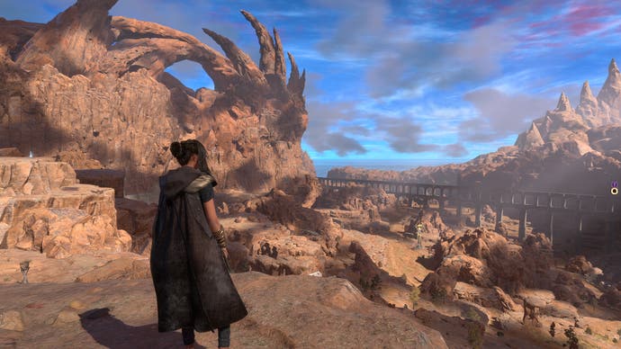
Character rendering in terms of details and materials is excellent, while animation fluidity is also impressive. The artists responsible for the animation in Forspoken have delivered exceptionally impressive results with a wide range of expressive animations all blended seamlessly together as you chain parkour and combat moves together. Given the intricate terrain, the quality of the animation feels even more impressive, with each step connecting and seamlessly feeding into the next. Basic locomotion is satisfying and fluid. Quality animation extends to characters too, and even hair rendering. Frey's billowing locks react to both player movement and external forces such as wind, lending everything a more realistic appearance when in motion. This does, however, only apply to primary characters.
Then there's the excellent foliage system which features full touch bending that reacts as you move through it. This isn't a hot new feature but it's welcome and helps increase immersion during exploration. Large scale battles really showcase everything coming together - the way Frey's cloak and hair violently react to powerful gusts of wind and the tendrils of these otherworldly foes produce a dramatic spectacle. Basically, this mix of strong foundational animation combined with secondary movement of other elements works exceptionally well and is one of the game's strong points.
Moving beyond animation, the particle system is also superb. As you engage foes, the screen is regularly filled with dazzling GPU-accelerated particles, swirling around Frey and the creatures in a dance to the death. Explosions and magical particles alike are beautifully realized in a way that helps sell the battle system. I was also impressed by atmospheric effects, including cloud rendering and fog. Forspoken utilises excellent frustum-aligned voxel fog, resulting in some deeply atmospheric moments. The sky system itself also makes use of ray-marched volumetric cloud simulation which can look good - though the colour choices sometimes leave a lot to be desired.
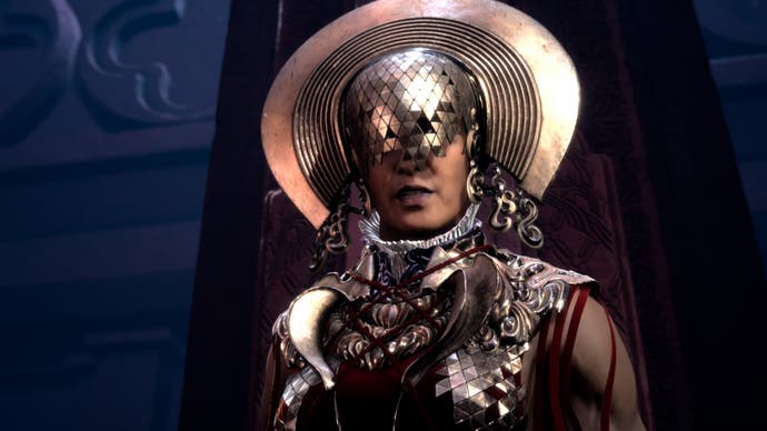
Other plus points include a range of display modes (three, each delivering different results on 60Hz and 120Hz screens), while the accessibility menu is another triumph. Forspoken offers a staggering number of customisable settings including solving some of the issues present in the original demo, such as the small text size. The menu in general is packed full of adjustable options which is something I always appreciate - even the map screen is beautiful, with the explored world presented as a series of tiny dioramas, really helping you to visualise the terrain in a way that we don't often see with map systems like this.
Alas, while Forspoken does many things well, there are elements of its rendering that fall woefully short of expectations especially for a game releasing exclusively on PS5 and the PC. The first and most egregious issue lies in its lighting. This is an area where I expected the game to shine, literally, given the quality of the six-year-old Final Fantasy 15 but, in fact, Forspoken is a gigantic leap backwards - at least in terms of execution. Modelling the behaviour of light is one of the most challenging aspects of real-time computer graphics. We're now in an era where hardware can utilise advanced ray tracing to accomplish this, but most games instead rely on alternative rasterisation techniques. Whether relying on pre-calculated data or another novel approach, the goal is to create something that is visually pleasing and 'good enough'.
The problem with Forspoken is that it's not good enough in most cases, especially when it comes to indirect lighting. A GDC presentation from Luminous Productions suggests that the studio is using a now old-school probe based system but I don't feel the issue necessarily lies fully in its technical implementation - choices made by the art team simply result in scenes that I would deem unattractive. There's a distinct lack of implausible indirect lighting, meaning that much of the environment has an even, glowy appearance that simply doesn't look right. This continues in Athia - the central city of Cipal highlights some of the problems: indirectly lit areas exhibit an unnatural sheen while areas bathed in light rely too heavily on a strong bloom component leading to an overly contrasty look, reminiscent of Xbox 360 and PS3 games. I also have issues with the use of colour - areas often bathed in garish colors that wind up looking gaudy more than anything.
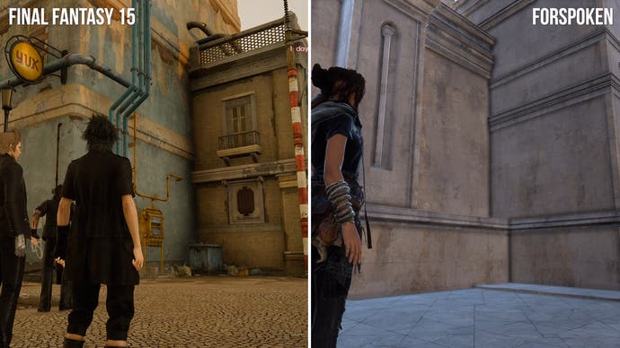
Ambient occlusion also looks extremely poor, slathered in AMD's FidelityFX features including FidelityFX Ambient Occlusion. Problem is, in this case, it winds up looking more like an outline shader with thick black lines filling out boxy scenes. The implementation just isn't very good - and the VXAO effect in Final Fantasy 15 on PC is demonstrably superior. This is obsolete tech these days, but vastly more effective. Surely a solution of comparable quality could have been devised for this game too, right? The end result is that many older games, including 2014's Assassin's Creed Unity, deliver vastly superior lighting solutions. Offline 'baking' would be fine, as Forspoken does not have a dynamic time-of-day system.
Shadows also have problems. Now, to be clear, the actual ray traced shadows are of good quality and they are a nice addition to the game, but there are limitations which compromise the visual fidelity. Without ray tracing, shadow maps are deployed, and these are largely fine. There's just one problem: there's no solution for distant scenery so things like trees and structures far off in the distance lack any sort of shadowing. It's the exact same problem Halo Infinite suffered from back in 2021. Combined with the odd colour choices and the world feels weirdly flat as a result.
With ray tracing, however, shadow quality is improved, but only near the player. The hybrid approach means the BVH structure surrounding the player is limited in size, so at distance, shadows revert to the shadow maps and still lack distance. This is a problem RT shadows tend to solve, but not here. Furthermore, RT shadows apply to opaque objects, so foliage and trees do not benefit. As a result, while they are a nice addition, they're subtle to the point where it hardly matters. This is a game that desperately needed a more robust ray tracing implementation - imagine what a different RTGI could have made? As a current-gen only game, it would have been a good choice.
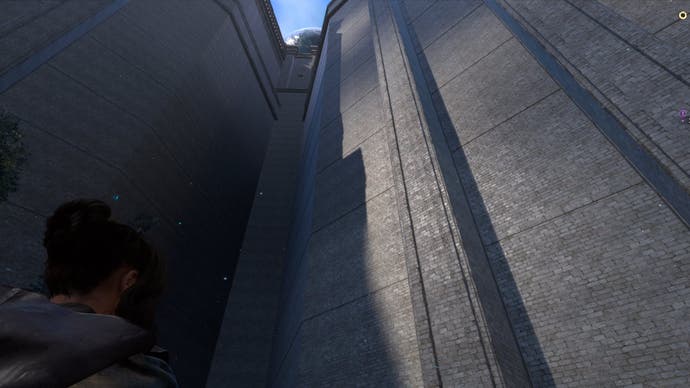
There's also something strange with asset placement and blending with the environment. The way in which buildings, structures and objects are placed and connected to the terrain feels decidedly awkward - almost like some sort of asset zoo. Buildings, for example, present as if artists dropped a random building asset onto the terrain and called it a day. The natural environments look great but I'm not a huge fan of asset placement and the repeating textures you often find on them.
There are also cutscene issues, from bizarre, low-resolution texture issues to awkward animation and inexplicable fades-to-black, the game feels uneven when presenting certain scenes to the player. Some of the major scenes are beautifully animated but the second tier cutscenes often fall a little short. Then there's the forced dialogue sequences with Cuff - these fill the player in on details regarding the world and their relationship, which is great, but there's an issue - they often lock you in place as the dialogue plays out. People already take issue with slow walking scenes in games but Forspoken has no walking scenes instead. Even worse, when such scenes are finished, you often remain stuck in place for an additional five to ten seconds before you can even move your character. Why? We can be reasonably sure it's not a background loading issue based on the way loading is so fast elsewhere.
I've discussed the good and the bad, but there are other elements can be either good or bad and that starts with image quality and technical performance. When deciding on the target resolution, the team decided to use a dynamic resolution combined with AMD's FSR2, which is used to upscale to either 1440p, in performance mode, or 2160p in the other two modes. The issue is that the internal resolution from which FSR2 works is often quite low. The internal resolution scales to a minimum of 50 percent on each axis which means performance mode, which targets 1440p via FSR2, can dip as low as 720p. The quality mode can dip to 1080p while RT is right in the middle of the two. I would say quality and RT modes both produce generally acceptable image quality with only busy scenes exhibiting noticeable noise and fizzle. The performance mode, however, can exhibit exceptionally poor image quality at times which is unexpected for a current-gen only release.
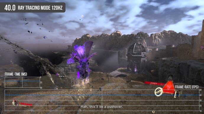
The resolution targets are the same whether using 60Hz or 120Hz output mode, I should note, but the 40fps modes both tend to hang towards the bottom end of the resolution scale when using it. Of all six modes, my preferred choice is the ray tracing mode at 40 frames per second. It's sharp enough and the most stable, especially with VRR. Quality mode improves distant detail but it's subtle to the point where it doesn't make a huge difference.
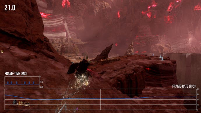
So, by and large, I'd say all modes are reasonably stable in typical gameplay scenarios especially with VRR engaged for performance mode. There are dips certainly but it's pretty decent overall but the issues noted in the demo are still very much present here and, in some areas, it's even worse. It's not even always clear why areas run slowly either. It's also hard to ignore the huge drops to performance seen in the quality mode - as low as 21fps, which is simply absurd. The notion that a stable 30fps is impossible in a higher resolution mode suggests that the dynamic resolution target simply wasn't aggressive enough or some other factor is dragging down performance. The ray tracing mode has some issues too but thankfully, they're far less frequent and less severe which is why I've grown to prefer this mode over the other two.
120Hz support? These offer similar performance to the 60Hz modes but with the benefit of a 120hz container and a wider VRR window due to frame doubling. While there are still significant dips in performance mode, VRR now covers this and it looks very smooth - assuming, of course, you have a VRR display. I'd still avoid quality mode at 120Hz though - not even VRR can save the day here, it just winds up feeling jerky and sluggish.
That's my technical critique of Forspoken, but what about the game? On the surface, it seems like an average action RPG but over time, it did grow on me. Basically, once you expand your arsenal and become accustomed to the traversal system, it begins to feel pretty satisfying and fun. Furthermore, despite being an open world experience, the length of the game is highly variable based on how you choose to play. If you turn up the difficulty and engage with the side content, you can get a good 30-40 hours out of the game, dropping to around 16 to complete it just by focusing on the story. The point is that unlike a lot of bloated open world games, Forspoken can be mainlined pretty quickly but there's still plenty to do if you want to spend more time in Athia.
It's just a shame that it's all let down somewhat by some curious technical decisions. Final Fantasy 15 was a true lighting showcase and its sequel looks simply beautiful. Forspoken is like the polar opposite: early Final Fantasy 16 trailers were visually dated but it's continued to improve Comparatively, the Project Athia trailer looked fantastic but over time, the visual quality took a hit leading up to release and it's now a mixed bag.
Ultimately, I walked away from Forspoken with mixed feelings. It has its positive aspects for sure but some of the technical choices are truly baffling and that makes me sad. I was really hoping to see the full potential of the Luminous Engine this time around but instead this might be the final game to actually use it - Final Fantasy 16 is using its own fork of the engine powering Final Fantasy 14, which in turn was forked off from the Crystal Tools tech used in Final Fantasy 13. Based on the incredible media we've seen recently, a lot of extra work has been done there and I'm truly looking forwards to the next Square epic.




.png?width=291&height=164&fit=crop&quality=80&format=jpg&auto=webp)

