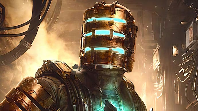
Dead Space tech review: this is what a best-in-class remake looks like
EA Motive delivers an overhauled game with dramatic visuals - yet it's not perfect at launch.
In 2008, EA released Visceral Games' Dead Space - a dark sci-fi horror experience that quickly amasssed a following and spawn multiple follow-ups. Fifteen years later, Dead Space lives again thanks to EA Motive. In this full-on remake, Dead Space merges many of the latest innovations in the Frostbite engine with a fresh new coat of paint and overhauled game design - but how much has the game changed and what does the new tech bring? To find out, I've played through the game on PS5, ran through the original on PS3 and spoken to developers David and Phillipe from EA Motive to get some deeper insights into the technology powering the remake. Here's what you need to know.
The original Dead Space comes from an unusual place - it was built from the technology powering the Tiger Woods games between 2000 and 2007 - but of course it's a completely different experience. Beautiful dynamic shadows and moody lighting helped create a memorable and atmospheric journey for players and, perhaps most surprising of all, it managed to run equally well on both Xbox 360 and PlayStation 3, a rare feat for that era. Through a modern lens, Dead Space shows its age, but what the team managed to create remains visually striking even now. Since its release, however, technology has evolved significantly - two console generations have passed, and the Frostbite Engine has become the de facto solution for most of EA's studios.
According to senior producer Philippe Ducharme, the goal from the beginning was to completely rebuild the original Dead Space on the Frostbite Engine while respecting its legacy. While including modern graphics features with vastly improved lighting and atmospherics would be key, one of the driving factors was the push to create a singular, seamless USG Ishimura. Rather than being divided up into sections, the ship can now be explored freely. Technical director David Robillard noted that seamless, fully streamed environments were previously not a strength of the Frostbite Engine, so a lot of people were pulled in to make this feature possible - and sensibly so, as this is something that should benefit future Frostbite games as well.
The result is that the ship was rebuilt in such a way that it is now physically plausible. The team actually created a gray box version of the Ishimura using the original map assets, in fact, and determined that many aspects of the ship design simply didn't make sense. What this means in practice is that the ship now feels more spacious and logical in its design but still feels true to the original. For example, in the original, the medical centre that appears in chapters two and five are completely separate maps but in the remake, it's all integrated into a singular environment and you experience the map changing as you progress.
You'll also experience seemingly random attacks as you explore and re-explore areas of the Ishimura, the result of an 'Intensity Director' that ties directly into the new level streaming system. The ship is broken into detached sub-levels, each with its own subdivisions, and level data is streamed in and out based on camera and player position. The rooms the player inhabits have logical meta information tracked by the game, letting the game spin up events from merely rattling a vent all the way to sending swarms of enemies.
Together, these changes can be stark - for example, we can compare the sequence of events for arriving at the medical centre in the remake versus the 2008 original. In the original, your only option is to take the tram, where you watch a graphic until the next level is loaded in the background. In the remake though, the tram is missing - so you travel through a different, seamless area, gaining access to a new power, kinesis, slightly earlier than you did in the original game. You then eventually arrive at the medical centre - with a doorway now unlocked and the tram available for future journeys. However, the tram never relieves the player of control as it did in the original, so it feels far more seamless. And if you retread this ground, the intensity director ensures that you never quite know what to expect, even in familiar terrain. So even in this small section, the game feels substantially different.
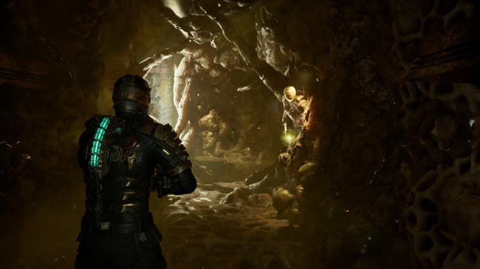
Of course, changes to the game design are one thing, but there's also a visual component. After all, a remake should offer superior graphics and that is indeed the case here. EA Motive has used a wide range of Frostbite features to bring the Ishimura to life, most notably with lighting and materials, which now play a key role in defining the texture of the ship. Physically-based rendering wasn't really a thing in 2008, but it's the standard now and all art assets created for Dead Space benefit. From metallic surfaces to the fleshy tendrils adorning the walls, everything feels more realistic.
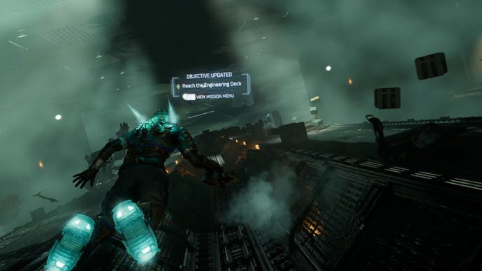
Another important aspect is volumetric lighting - this is a huge departure over the original game which instead relies on billboards positioned to give the impression of volumetrics. With this remake, the team deploys Frostbite's excellent frustum-aligned voxel fog and it's used everywhere - from shafts of light piercing the darkness to low hanging mist nestled along the floor, it's a significant part of the visual makeup.
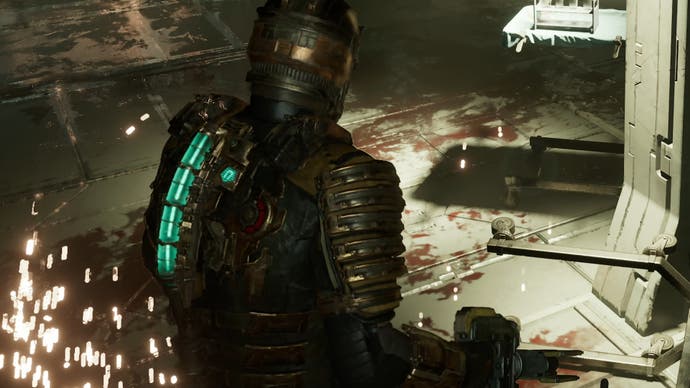
Furthermore, special consideration was paid to how volumetric lighting bodies react in a zero-G environment, given that the game can transition between the two states. It works pretty well. The developers also revamped the particle system - not only are particles beautifully rendered but they also physically interact with the environment and objects around you, with sparks even bouncing off Isaac's suit, leaving small residual markings across his armor.
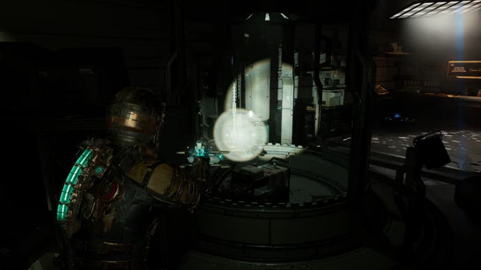
This same approach to physicality also applies to audio - according to Phillipe, a lot of time and effort was poured into audio engineering and creation. Dead Space makes excellent use of surround sound audio, for those with a home theater, including exceptionally rich bass. It also works well with headphones.
What really impressed me, though, is the simulation of sound propagation. When a sound is produced by the game, this sample is processed to simulate the distance, velocity and direction of travel. If a sound plays down a curved hallway, for instance, it will realistically bounce around the environment before being played back, simulating realistic behavior. It makes a huge difference. Furthermore, David noted that they've implemented a system in which sound samples are normalised, similar to how materials are normalised for use in a PBR pipeline, and things like mass, surface and surface contact points are taken into account when the sound is played back to ensure that it respects the physical properties of the world. The takeaway here is that, yes, Dead Space sounds really good.
Furthermore, speaking on visuals again, nearly every light in the game can cast a shadow ensuring a far more coherent presentation and, in quality mode, the game employs Frostbite's ray traced ambient occlusion which adds depths to crevices around the ship. Now, this isn't nearly as robust as the RT mode available in The Callisto Protocol so don't expect a major transformation but it is a nice bonus that does improve overall fidelity. It also means that you can opt for the 60fps performance mode on PS5 or Series X without sacrificing nearly as much in the way of visual quality.
Speaking of consoles, I did want to touch on image quality and one feature that perhaps doesn't perform as I'd have liked. Xbox Series X and PS5 both offer a 60fps performance mode and a quality mode with RTAO and a frame-rate capped at 30 fps. The game targets 1440p in performance mode and 2160p in quality using FSR2, though we did find much lower pixel counts often thanks to DRS.
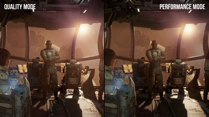
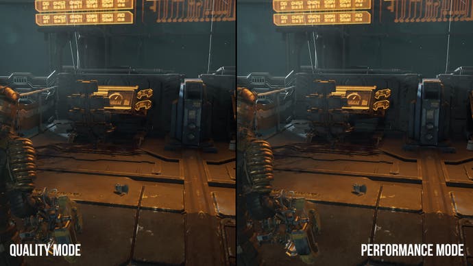
These resolutions are reasonable, but the Variable Rate Shading doesn't work as it should. This feature is designed to save on performance by varying your shading rate dynamically across the frame. Conceptually, the renderer should retain full shading rate for well-lit areas you're likely to focus on, while darker scenes can use a reduced rate with larger blocks. This feature is enforced across every platform but the software VRS solution used specifically on PS5 has a serious problem - it basically ruins image quality. Essentially, darker areas of the image use more extreme VRS, resulting in serious pixelation which seems to scale with the internal rendering resolution. The good news is that the dev team have officially acknowledged the issue and are working on a patch to improve things on console while offering the option to disable VRS entirely on PC.
If you can't wait for that patch and have a choice, I'd recommend playing on Xbox Series X over PS5 right now. Oliver's piece comparing the three systems against one another will provide more detail when it arrives.
So despite the issues with VRS plaguing the launch version, everything else is an example of what a best-in-class remake looks like. Dead Space is absolutely on par with the likes of Capcom's Resident Evil remakes, offering something for fans and newcomers alike. I feel it's particularly worth playing for fans of the original game, as there are a lot of changes to the design despite still adhering to the basic structure. As you play, encounters you may have anticipated don’t happen, items are moved around, and everything feels like it’s playing with your expectations.
Visually speaking, the Dead Space remake doesn't match the heights of The Callisto Protocol, but it's still a handsome game with smooth performance across every console. Ultimately, if you enjoy sci-fi horror, you need to give this one a shot.
