Digital Foundry: Hands-on with SteamVR and HTC Vive
Valve adds an extra dimension to a nigh-on flawless VR experience.
Valve and HTC's Vive virtual reality system isn't just about the headset, or about the immersion - which is simply incredible, by the way - it's about space. At the risk of venturing into hyperbole, you could even suggest that it's about creating a first generation holodeck of sorts, to the point where there's even a subtle homage to Star Trek: The Next Generation. As you wander around the play area, the signature grid pattern appears before your eyes in the form of glowing vectors - defining the safe limits of the space, and stopping you from hitting the walls in the real world.
And that's the key difference between Valve's offering and the other VR demos we've experienced at GDC 2015: the SteamVR demo software creates an immersive virtual space that offers you some degree of mobility, encouraging you to walk around and to explore the play space. In both the London Heist Project Morpheus VR experience and Crytek's new Dinosaur Island demo for the Oculus Rift Crescent Bay prototype, the action takes place mostly in front of you, with little encouragement to actively explore the environment. You can look behind you of course, but there's not much going on, and the actual amount of movement in the play area is limited.
In many of the SteamVR demos we played on the HTC Vive prototype, exploration of the play space is a crucial component. While actual travel around the gameplay environments is necessarily limited by the physical dimensions of the room, what you see through the visor can look almost limitless. One of the less interactive demos in Valve's suite is called TheBluVR Encounter. You wander about on the deck of a sunken ship, interacting mildly with schools of passing fish, flicking the controllers to scare them aware before the arrival of an enormous whale, swimming peacefully around you as you walk around the deck. The sense of scale underwater is breathtaking, but the actual physical area is limited by the geography of the deck itself. Despite the obvious limitations, what becomes clear is that just a little bit of freedom can go a long way.
Vive is said to operate in a space up to 15 by 15 feet, your presence in the area tracked by two Steam "lighthouses", sitting across from one another in a diagonal in the room, and apparently able to track multiple headsets and controllers. An initial calibration is required to define the area, and while a handful of the demos concentrate on a play space sufficiently large to walk around, you can define just how large the area is. The two lighthouses could give Vive a real edge over the competition, as it's not just tracing your movements from one perspective; it has the ability to track you and the entire play area with complete coverage.
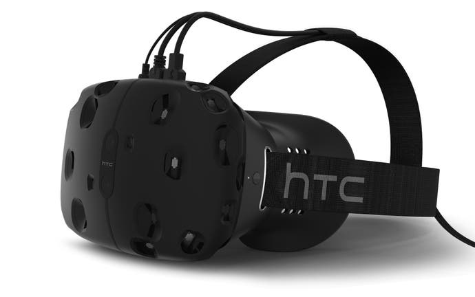
Right now, the unencumbered sense of freedom is curtailed slightly by the prototype Vive set-up. Put simply, there are cables - lots of them. Plumbing yourself in begins with an elasticated belt you tie around your midriff, with cables feeding out to the two wand-like VR controllers placed in each hand. Then the headset is attached, with cables of its own. We can reasonably expect the controllers to be wireless by launch, but the Vive HMD itself will still need to be tethered to the PC.
At this point, it's worth pointing out that those who wear glasses might have issues. My Valve guide seemed genuinely surprised that my spectacles wouldn't fit within the Vive enclosure, but I wasn't especially shocked, having had exactly the same issue with the Oculus Crescent Bay prototype just half an hour earlier. Right now, of the three VR platforms tested, only Project Morpheus accommodates my spectacles without issue, but of course, all three platforms are not yet production models and may see improvement. Indeed, Valve seemed happy to have found a new data point that could be used to improve the final design.
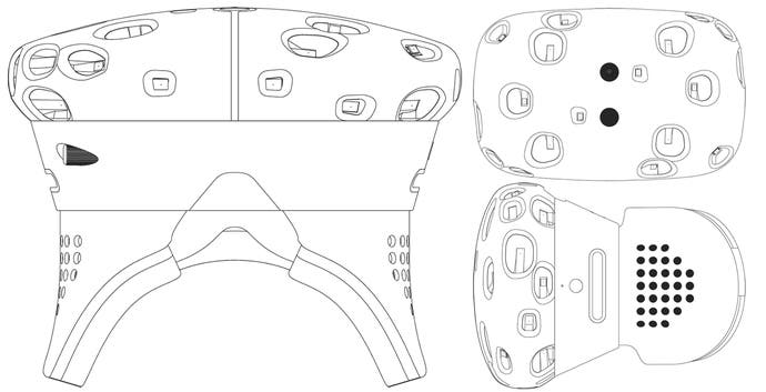
Once the headset is donned and firmly secured, it's possible to get an idea of overall image quality. Detail on the full spec is limited right now, but Vive uses dual 1200x1080 displays - one for each eye. That's a significant amount of extra horizontal resolution compared to Morpheus, and the image is cleaner, but not to a revelatory degree. Right now it seems that overall field of view appears broadly equivalent between all three systems, with just minor black borders to the left and right in peripheral vision, but there's a very definite sense that resolution on all three offerings isn't quite there and could use a bit of a boost. However, this would have implications not just for the cost of the unit, but also the power required to render the experience.
While Vive doesn't score top marks in terms of image clarity, the handling of motion is absolutely best in class. Refresh rate on the displays is 90Hz - slower than Project Morpheus, but perfectly fine for the task at hand with no obvious smearing or blurring in motion. Where Vive and SteamVR really impresses is in its sheer consistency - frame-rate is locked throughout every demo, without the tiniest hint of perceptible judder. Despite being particularly sensitive to VR motion sickness, I made it through the entire 20-minute interactive presentation without even the slightest hint of nausea. The consistency extends to image quality too - while overall clarity isn't tremendous, you quickly adjust to the soft image, and there are no telltale aliasing issues to take you out of the experience.
Earlier in the day, Oculus CTO John Carmack expressed relief that the thorny issue of devising a controller for VR experiences wasn't his particular problem, but pointed out that while some kind of representation for your hands in the virtual world is desirable, it isn't totally essential for all applications right now. We got the impression that Oculus is looking into the issue to some degree, but kicking the can down the road for now. Valve obviously disagrees. Vive will ship not just with the lighthouse motion trackers but also with dual VR controllers - wand-like devices not unlike PlayStation Move, and used in exactly the same manner in many of the demos we tested.
The controller's position and orientation is tracked, with underside triggers used to grasp objects - just like Move in the Morpheus demos. However, designed from the ground up for VR, Valve's solution is a step ahead, with additional buttons and a touch sensitive ring on both controllers, which should allow for some granularity in terms of interaction. This wasn't really required in the demos we tested though, which used the main underside trigger on each controller.
The demos begin in a launcher area, where multiple titles are selectable (only a handful of which we actually got to try). It's here where you first explore the VR controllers, with the trigger used to inflate balloons, the other wand used to bat them away. Moving into the first demo, we're introduced to the 'walkabout' concept - HTC Creative Labs offering up an environment defined by vertical hexagonal columns, a little reminiscent of Superman's Fortress of Solitude, descending and ascending around the player as you walk around.
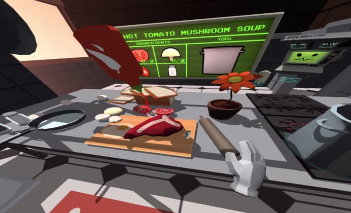
Owlchemy Labs' Job Simulator demo was interesting - a fun romp in a kitchen environment that sees you darting around the room, locating ingredients, tossing them onto pots, pans or chopping boards. Cartoon-like in both presentation and action, the demo did support travel to a limited degree (you need to visit the fridge to the left quite often in order to access additional ingredients), but it's easy to imagine this working in a play space of any size.
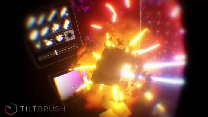
Next up: TiltBrush, a 3D art program created by Skillman and Hackett. The play space becomes the canvas, with your right hand spraying various paints and textures into the inky blackness of 3D space. The left VR controller carries the tools - use the 'brush' to select a new colour, or twist your left hand to access a new texture tool. It's possible to look around the 3D space, into and around the art you've created, which glows like neon in the pitch-black environment.
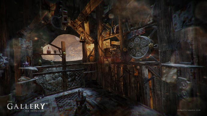
It's back to exploration and interaction with The Gallery, by Cloudhead Games. It's a fantasy game heavy on puzzling as you seek out key objects used to fix broken mechanisms, slotting them into place and seeing what happens next. We didn't have anything like enough time to explore the slice of the game world in the demo here, but even the small things are delightful - just picking up objects and giving them a closer look is oddly satisfying, and as the VR controller smacks into the HMD in the outside world, a testament to how good the immersion really is.
The presentation ends with Aperture Science, created by Valve itself - a small taste of how cool Portal would be played out in a 3D world. The player stands in a robot repair area, tasked with fixing a defective droid, pulling it apart, then spinning its innards around, looking for a fix. When you accidentally instigate Armageddon, GLaDOS makes an appearance to taunt you for your incompetence - and that's it. The GDC 2015 SteamVR experience is over.
It ends on a high, with the Aperture Science demo featuring an almost Pixar-esque CG quality, but what's curious is how consistent the VR experience is throughout the entire series of demos from a range of developers, using a wealth of different engines from Source to Unreal Engine 4 to Unity. It seems that the real strength here is the quality of the VR backbone Valve has developed, along with the excellent HMD and the enhanced play space offered up by the lighthouse tracking system.
To date, it's the most impressive, consistent implementation of VR we've experienced. But by opening up a new dimension in mobility we've not seen explored (yet) on other VR systems, we wonder about the scalability game makers will need to incorporate to accommodate play areas that could vary massively in scope. We also wonder whether introducing the concept of traversal into what could be rather limited spaces will work at all on some titles, and how oppressive the real-world limits will be. The TNG holodeck grid is apparently a lock system-wide for defining boundaries in all SteamVR titles - and as cute a feature as it is, we hope to see as little of it as possible.
There's also the question that lingers around all PC VR experiences - just how much horsepower you need to get the level of flawless consistency we experienced at Valve's booth. On that count, we do have some answers: the test rig used for the GDC demo utilises a Nvidia GeForce GTX 980, but it is a single card set-up, so the PC powering the experience isn't the multi-thousand dollar monstrosity we thought it would be. Valve is also keen to point out that the GTX 980 shouldn't be seen as an entry-level requirement to VR - it says that its aim is to make VR as accessible as possible.
Whether that accessibility extends to the price-point remains a mystery at this time, but we suspect that the HTC Vive will be at the upper end of the price-range compared to the competition. It has to be, in order to accommodate the cutting-edge HMD, two controllers and the satellite lighthouses.
Disengaging ourselves from the many-wired prototype, it's surprising to learn that the seemingly least-complete VR hardware is set to be the first to reach the market. The HTC Vive is confirmed for a 2015 release, and could possibly arrive simultaneously with the main Steam Machine hardware, due in November this year. What we saw today was hugely impressive, but the play space concept will challenge game-makers to an even greater degree than the already daunting challenge 'standard' VR already represents. But in the here and now, the technology is simply stunning, and we can't wait to see if the final SteamVR software manages to match or even exceed the quality and consistency of the experience seen here at GDC 2015.

