Crusader Kings 3 is trying to get better at bringing you on board
And make it a more pleasant experience once you're there.
The meeting rooms at Paradox Studios are all named after paradoxes. It's a bit cute, sure, but I do like how it means you keep saying things like "let's go to Buridan's bridge - Schrodinger's cat and the problem of evil are busy." And it's a nice reminder of where you are. This is a studio that makes games about history, and science, and building and managing societies. Its next major game is Crusader Kings 3, a follow-up to a huge hit with a cult following, and it has to juggle expanding that audience while appeasing an especially ardent old one. It's also a game releasing at a different sort of time to Crusader Kings 2, with a different moment in history waiting for it. It would help if there were some very clever people walking around the studio - and if that means the office humour's a bit professor-at-a-dinner-party, so be it.
Crusader Kings 3 itself is essentially Crusader Kings 2, but tall as opposed to broad. I visited Paradox to take an early, hands-off look at it, and the two points repeated to me were that it's "way deeper" in a lot of places - despite Crusader Kings 2 having a good seven years of DLC to it - but is filled with far more "usability" in a lot of others. The series is notorious for its impenetrability, at least on first glance, and despite an especially ardent fanbase keen on retaining the challenge, the studio seems intent on tackling it. Everyone from Ebba Ljungerud, CEO of Paradox Interactive, the publishing arm that oversees the developer Paradox Studios, to the game director Henrik Fåhraeus spoke about this awareness that players will open up a Paradox game, take one look at the UI and close it again. They knew it needed improving.

There was less agreement on what you call the thing they're trying to improve, mind. Fåhraeus and others were oddly put off by the word "accessibility", preferring "usability" instead. Some noted that players can mistake complex UI for complex systems. Others referred to the old UI as like an "archaeology dig" - because there should be prestige in the thing itself, not in the act of digging away layers of stone. But the point, however you put it, remains the same: Crusader Kings 3 is trying to get better at bringing you on board, and make it a more pleasant experience once you're there. It just has to stay a deep one too.
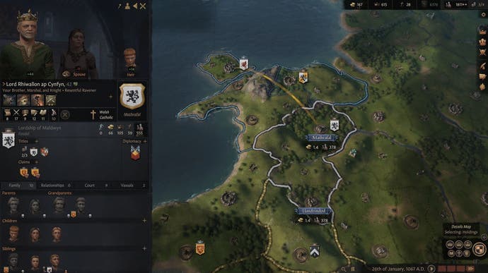
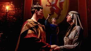
The actual result, from what I saw, is a big tidy up to everything on the surface. The tutorial will be "Stellaris-style" - as in, there will actually be one - and everywhere you look there are tooltips-within-tooltips, the holy grail feature of grand strategy UIs. Little pop-up windows explain what something means, and within them another explainer pops up, of what something else means, and within that another. It also means some flashier stuff, too. Characters themselves - your dynasts or your rulers, whatever you want to call them - now have animated avatars, "Sims-style", that hint at their personalities and traits. Sneaky ones will twiddle their fingers together sneakily, pious ones will look pious, and so on.
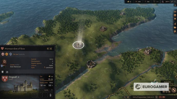
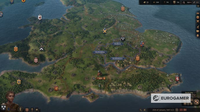
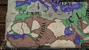
The push for clarity extends to the map itself, too, with the emphasis from the team at Paradox on how it'll be much more "granular". It's of course very pretty, in that pointy, medieval sort of way, but the substantial difference is you can now see smaller individual settlements on it. There are also improvements to the various views you can actually have, too, allowing you to "paint the map," in Fåhraeus' words, more effectively.
From the familiar main map screen there's also a better system for explaining what exactly it is you need to do next - or what your larger goal ought to be - as opposed to those various top-of-the-screen orbs in Crusader Kings 2 that didn't always help. There are hints that you can customise, and you can now see that you're third in line for a throne, for instance - as well as who exactly is in front of you - so it's a bit easier to know who needs bumping off or otherwise climbing over for you to get in charge. Another point for UX clarity.
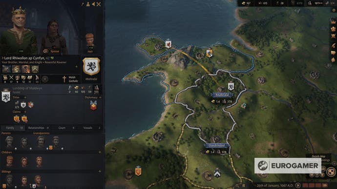
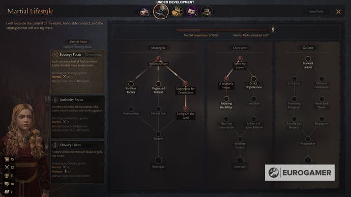
Fåhraeus also explained a broader push for putting "characters first" in Crusader Kings 3, and "character and dynasty development" was an oft-repeated phrase from most I spoke to. Using animations to show your character's character, so to speak, is obviously one part of that, but it's also where a plunging depth of new systems comes in. Characters in your dynasty now have multiple skill trees, for instance, which are progressed according to that character's chosen lifestyle. There are five lifestyles and three skill trees within each of them, so you can choose a "Martial" lifestyle for one, for example, if you feel they'd suit it. Then, as time progresses, they'll advance themselves through the three Martial skill trees (Strategist, Overseer, and Gallant), according to what's happened in their life, unlocking substantial perks along the way.
The hope, Fåhraeus explained, is this makes most lifestyles viable in some form, "even Learning, which in Crusader Kings 2 was seen as a pretty weak base skill" as he put it, and from what I saw it looked satisfyingly deep. It plays into Crusader Kings' nature as a strategy game masquerading as an RPG - one of the things that makes it stand out in the first place - and from the look I had at it, the skill trees seem absolutely at home in the game. As an addition, it feels like common sense.
Last of the character-focused additions is a deeper system of genetics, which you can manipulate in a way to try and pass on desirable traits from one generation to the next. All of it filters back to a drive for player freedom, too, which Fåhraeus and the team see as sacrosanct in Crusader Kings. "I think there's a player type who really appreciates that as well," he explained. "You know: 'I want to plan my family and my dynasty and I want them all to be red-headed dwarves with freckles' or whatever... so we do cater to that player fantasy too."
The depth of systems goes on. There's also a new, "three-tier" religious system which, to tie it into the idea of player freedom, Fåhraeus said would let you "tailor a heresy, to what you want it to be," right down to view on a specific crime, just as you'll have control over your dynasty's religion itself. If you want to be a devil-worshipping Christian, you can. There's also a kind of "sub-dynasty" system, which fans have been after for a while, that clears up some of the problems with seniority and succession, and there's also an in-progress system centred around "stress".
It's worth noting the current iteration of that is a kind of literal stress meter for your character, that builds up or simmers down depending on the situation and can affect their characteristics and state of mind - including causing a kind of breakdown. The team are still tinkering with that, however, as it has the potential to become either overbearing or ignorable if the balance is wrong.
Systems, systems, systems, in other words. Combined, the hope is the added depth they bring dovetails with the added clarity over the top, keeping new and old fans happy. From what I saw, that should be possible. But as other issues with Paradox and Crusader Kings have shown, the studio has more than one problem to solve.
