Tokyo 42 and the unkillable charm of isometric gaming
A timeless angle.
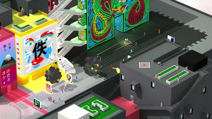
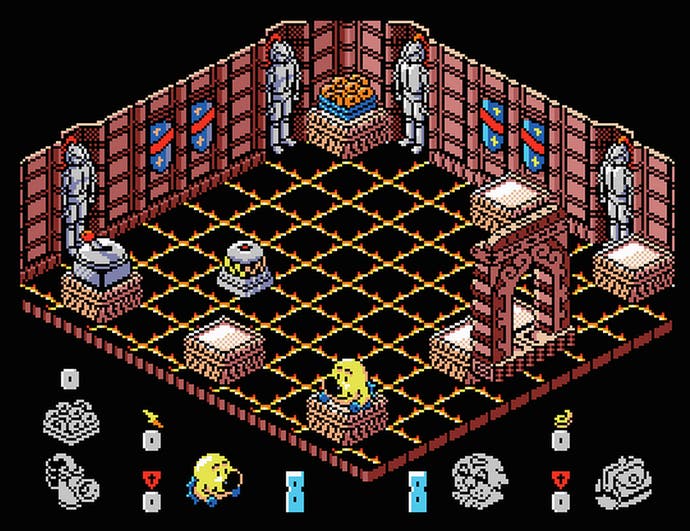
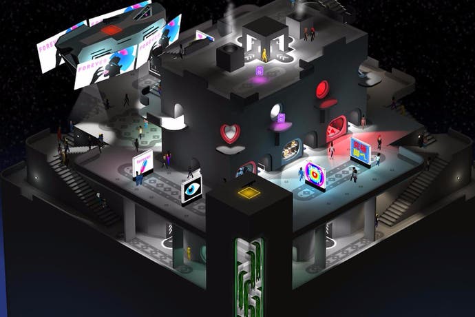
Hardware generations come and go, graphics processing techniques tumble into and out of fashion, but the allure of so-called "isometric visuals" refuses to wane. Last year saw the release of Gareth Noyce's Lumo, a tidy little 450-room throwback puzzler starring a chubby wizard, that harkens back to the fixed vantage points and tile-based environments of 8-bit classics like Head over Heels. This spring has already given us Torment: Tides of Numenera, InXile's tribute to the pick of Infinity Engine RPGs. And later this year you'll get to play Tokyo 42, an open world assassination game which unfolds on an airborne, plastic city of exhilaratingly jammed-together architectural styles, rendered in 3D but with a zoomed-out, semi-manual camera that calls to mind the original Syndicate.

Created by two-man developer SMAC, it's a bouncy arcade affair that wears the trappings of a tactical sim lightly but convincingly, as you scuttle around the busy yet idyllic metropolis claiming skulls, evading rival assassins or police and getting to the bottom of a conspiracy. Infiltrations oblige you to either avoid patrolling guards or become them - everybody in the game's world has an artificial body, which (aside from robbing death of its sting) means you can spend "juice" to alter your appearance and blend in. The stealth is otherwise redolent of Metal Gear Solid, as you duck under AI viewcones and wait for alertness states to reset. Firefights have more in common with Radiant Silvergun - slow-moving bullets, rockets and grenades crowd the screen, challenging you to keep track of your tiddly, trench-coated killer amid the carnage.

The PvP arena multiplayer, meanwhile, takes aim squarely at Assassin's Creed's lapsed multiplayer - every player starts off incognito in a throng of NPCs, and you must uncover opponents by keeping your eyes peeled for suspicious behaviour and dispatching your trusty pet cat to sniff out nearby players. All in all, Tokyo 42 has the makings of a delightfully open-ended throwback blaster, refreshingly unencumbered by supposed modern prerequisites like character or weapon upgrades - but what really grips me about the game is how it revels in the possibilities of an isometric viewpoint.
I'm using "isometric" extremely loosely in this piece, of course (fair warning, graphics programmers - the following may strike you as painfully noobish, assuming you haven't clicked away already in disgust). Commonly taken to mean a game with a camera positioned diagonally above the environment, "isometric" actually refers to the orthographic projection of cubic volumes onto a 2D plane to create the illusion of depth, such that all the visible angles on each cube equal 120 degrees. "True" isometric is, however, hard to achieve with older displays and CPUs, because it's difficult to draw angles that are multiples of 30 degrees when you're working with square pixels. In fact, many of the games often labelled "isometric" actually use "dimetric" projection, in which only two of the cube's visible angles are identical, or "trimetric" projection, in which all the angles are different.

Isometric or near-isometric projection originally came into use as a way of faking 3D at a fraction of the computational expense. But over the decades, isometric gaming has flourished into a distinct genre with its own aesthetic and artistic possibilities, even as those computational overheads have evaporated. One advantage of isometric projection or techniques that mimic it is that artists are able to really fine-tool or stylise each object's internal geometry, colour and lighting contrasts, capitalising on the fixed perspective - you might cast one face of the object in strong shadow, the other in sunlight. Another effect is to impose a discreet diamond motif on the visuals, formed by the arrangements of cubes - a motif that can be adhered to and broken from to gently thrilling effect, as in the gorgeous iOS title Monument Valley.
Tokyo 42 allows you to rotate the view around the protagonist by 45 degree increments, exposing pathways around buildings, dug-in enemies and beguiling details such as waterfalls or apartment owners smoking on balconies. But its cuboid world is also clearly designed to be appreciated in isometric view, made up as it is of striking contrasts that are less noticeable when viewed from 90 degrees on - terracotta red plazas cutting across walls daubed pistachio-green, bright yellow stairways slicing through matt black monoliths, and animated ad boards that are subtly arranged to play up that underlying diamond pattern. You can even make out the diamond motif in the flight paths of hovercraft - each a lovingly faceted chunk of cyberpunk, like a WipEout racer repurposed for civilian use.
The game's world was, in fact, originally supposed to be a flat pixel-art illustration, but SMAC opted for polygonal 3D and a spinning camera after noting that players were struggling to navigate. "When we started we actually had the game running in pure isometric orthographic, but it was simply too hard to differentiate foreground and background," observes studio director Maciek Strychalski by email. "This is important in our game because we have vertical traversal and combat and players need to be able to read depth. This wouldn't have been an issue if we were a pure twin-stick shooter or flat plane game.
"To get around this we moved the camera waaaay back, like a kilometer, and tightened the Field Of View down. This did two things, it allowed for a tiny amount of parallax and it allowed us to implement a Depth Of Field effect (which is impossible without depth information - i.e. impossible when using an orthographic camera which has no depth information). This gives the player that extra information needed to parse depth."
So why go to all that effort to retain the appearance of a faux-3D game, when you're actually working in "true" 3D? "Well, it's just neat isn't it? Especially when viewed from a 45 degree angle, the lines are so graphic and consistent to the eye. I find it beautiful."


