Super Mario Maker 2 proves Mario is always better with a world map
The final update brings a rich history into focus.
The Japanese version of Super Mario World for the Super Famicom came in a long yellow box that always felt absolutely stuffed. There was the cartridge in there, and a plastic mount for it I think, but there was also the instruction sheet, which was folded and folded on itself, and when unfolded spread out to a surprising degree. And at the centre of it was a map - a beautiful, detailed map. Here was Super Mario's world, islands, bridges, oceans, rivers. Even now I get a bit emotional thinking about it.
Just before this, Super Mario 3 had introduced the idea of having a map in Mario games, and I really love the little world maps it offered, plants and animals bobbing along with the beat, different route choices suddenly available, that astonishing bit where you go up into the sky and then explore the clouds. But Super Mario 3 is the tasting menu Mario, and it felt like you were getting a bunch of different arrangements of dishes as much as being allowed to visit actual places. Super Mario World actually linked all its little lands together into one place. Its map felt much more real and meaningful because it properly provided everything with a context.
After a while with Super Mario World you were actually playing the map as much as the game, hunting for levels that had multiple exits, trying to work out where the secret Star network was strung. I remember being stuck on Cheese Bridge for what felt like years - I just sensed I was missing something. I remember returning to the map and really trying to place myself in its world. A magical experience.
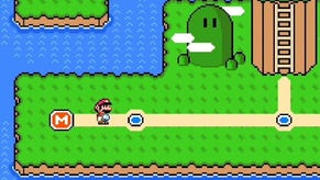
All of this is why I now realise that Super Mario Maker 2 has never really felt complete to me. And now it is complete. The latest - and final - free update adds a lot of very cool stuff that feels like you're properly playing with the outer reaches of the Mario universe. There are new parts, new wearables, even the addition of Koopalings. There's a wonderful nod to Super Mario 2 that kind of blows my mind. But the new update also allows maps. With World Maker, suddenly you can piece your levels into something larger. Mario deserves a map and now he has one again.
World Maker allows you to pull a bunch of levels together into a world a la Mario 3 - a map that fills the screen. Levels are strung along paths leading from a starting point to a castle, and you can link several worlds together to make what amounts to your own full Mario game. It's basic, but playful. Alongside levels you can also chuck in Toad Houses and warp pipes. You can place mountains and incidental features, and you can choose between a range of classic Super Mario World themes, including deserts and clouds and all of that jazz.
It will be a while before I start getting the most out of it, and I appreciate that the limits to the system might frustrate the more creative Super Mario Makers out there. But what I was not prepared for was the sheer nostalgic power of being able to meddle with this stuff in the first map. For a Mario map fan like me, it felt like being granted abilities that have always been deemed too much for players. It's like looking into the Mario Ark.
Honestly: this stuff properly hit me. When I first loaded World Maker up I created the classic grassy environment with a few hills and a wobbly path to the castle. I left most of the grid as water, and experimented with placing new squares with a lovely - and slightly incongruous - metallic clang and seeing what kind of hills and level furniture were available. It was fine.
But then I changed the theme, picking night-time, and the world I had made was transformed. Suddenly the sea was replaced with stars, and the grass I had made floated in space and glowed a kind of luminous turquoise that I have always associated with the night-time sequences of Mother 2. It was suddenly magical, this piece of Mario land floating in the darkness. It reminded me of the old Star locations in Super Mario World, but it also felt like seeing the Mushroom Kingdom afresh again, visiting at night, travelling the countryside, the whole thing filled with promise. How very Mario.
What will really talented players be able to do with this? It's worth saying that even Mario hasn't always gotten the map business right. The Super Mario Bros re-release for the Game Boy, which is a weird and lovely thing, retconned maps into the main campaign in a distinctly underwhelming manner. Mario's candylands suddenly looked a bit like industrial quarries, and a map that only allows you to go in one direction isn't that much fun anyway.
I didn't really like the maps of Galaxy's solar systems either, which seemed like unnecessary additions to a game that had hopped beyond any kind of two-dimensional representation. Only with Super Mario Bros U do I think we get a map that works once again - and it makes this under-appreciated Mario game on a doomed console feel like a true sequel to the mighty Super Mario World.
After that the 3D World Map was a lovely surprise, particularly because of the tinkly noise you made when you ran across those frozen train tracks. But by then I was starting to realise that the classic Mario map is made of those blocky pixels of the 8- and 16-bit era. The maps to Mario 3 and Super Mario World were the first signs to me that this game about running left and right and jumping on things was actually creating its own lore and traditions and sense of place. Mario was creating its own context. I look at the maps of those two games even now in my forties and I still feel like I'm back at the beginning of something, like I don't know where a path is going to lead me or what is possible.
Astonishingly, I now get that feeling again from Super Mario Maker 2. What a great final update. What a perfect send-off. How very Mario.


