Stormrise
Whipping boy.
True, units can be directed from the viewpoint of another, so if you get one up on a tall building, or take an air unit up above the map, you'll have a more traditional perspective from which your army can be commanded, using the square button to drag out pointers to objectives. Unfortunately, you'll also be so far away from your diminutive troops that you'll have no idea which are which, nor what they're seeing. Given that the average encounter between units lasts for about 10 seconds, you'll get very little chance to find out what's been engaged, select appropriate backup and send it in before the entire skirmish is nothing but a greasy patch of asphalt. Additionally, units can only be grouped into maximums of three, meaning any kind of concerted assault requires nauseating flicks back and forth as troops are piled into engagements.
Added to that, any air units hovering naively over the battlefield are rapidly exterminated, ridding you of their perspective, and the resource cost of these units means that they're hardly expendable drones. It all adds up to you feeling wildly out of control, briefly possessing units and sending them to their poorly co-ordinated deaths as the AI enemy inexorably spawns and grinds down your position. Factor in the complex, multi-layered environments you'll be fighting in and the savagely passive troops under your command and the battlefield is reduced to a bewildering chaos of isolated units, idle resources and frustrating mistakes.
Flicking to units and resources works quickly, but does nothing to alleviate the confusion. Firstly, in order to orientate yourself effectively you need to memorise where every unit you switch to is actually going to be. Suddenly finding yourself hovering behind one of the twenty to thirty units in the field gives you no real idea of where you are, unless you know the map well enough to judge it in relation to the whip from your last position. The garishly neon strategic overview map is of no use either - you can't give orders from it, scroll around it or relate it to the battlefield in any meaningful way. Similarly, the almost constant reminder that there's been a 'unit lost' gives you no indication where they may have fallen and where your defences might consequently need shoring up.

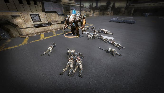
Units show no initiative at all, happily jogging past enemies without firing or running right up to emplacements, being shredded in a matter of seconds, before they open fire, and unit skills, such as grenades, shields or AOE attacks, have to be activated individually for each unit - a fiddly and time-consuming process that ramps up the tooth-grinding even further. More than once I observed two platoons of well-trained cyber troopers rush into each other's ranks and out of the other side before turning to shoot. The firing animations seem to be optional too, with soldiers falling in groups when nobody is firing, felled en-masse by an unseen hand. Graphically it's dull, dour and uninspiring, with the odd bit of quirky unit design lost in a sea of bland. Married to a frame-rate that dips more often than the interest rate, clunky, stuttering animations and units that regularly get stuck on scenery, each other or just thin air, and you're looking at a real mess.
Once in a while, however, it does all come together. There were brief spells where I was navigating tight urban corridors, ducking into cover or holing up in buildings, switching back to resource nodes or aerial units to churn out troops or check enemy movements, when I could see the logic behind the decisions here. Times when it didn't seem like such a ridiculous idea to base an entire game around the limitations of its control scheme. There are undoubtedly excellent ideas hiding behind the scenes; they're just stymied by the method of execution.
