No Man's Sky's most aggravating omission (on PS4)
An obtrusive UI drops the photobomb on an otherwise breathtaking game.
No Man's Sky is a very pretty game. Its bold use of colour, surprising sentient life, and dynamic climate system offer vistas that stick in the mind for quite some time. While its procedurally-generated environments aren't quite as stunning as those shown in early trailers, it's not far off with each planet's terrain, skyline, flora and fauna offering a mesmerising sight for sore eyes. Some may be disappointed by its lack of thriving cities and lush forests, but for my money No Man's Sky still offers the most varied take on "barren alien wasteland" the gaming space has ever seen.
As such, No Man's Sky's eerie environments just beg to be preserved. How convenient then that both the PS4 and PC have buttons dedicated to snapping screenshots.
This has become something of an obsession of mine since I first booted the game up. Stumbling into a variety of procedurally-generated panoramas that I know I'll never have a chance to return to has brought out my inner shutterbug. In a game of 18 quintillion "planet-sized" planets, everything you encounter is unique, so there's a strong temptation to document the universe's more aesthetically-pleasing accidents. For me, No Man's Sky is as much about roleplaying as a photojournalist as it is about the life of an astronaut.
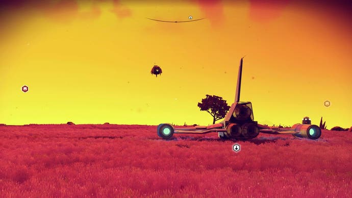
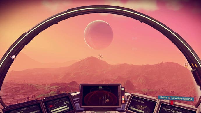
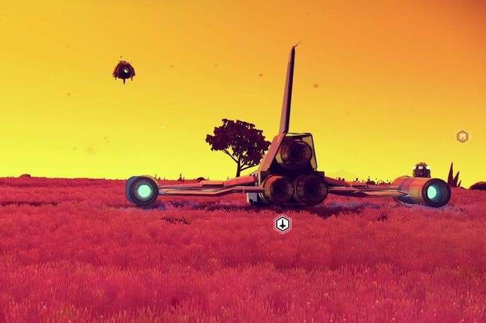
There's only one problem: there's no way to turn off No Man's Sky's painfully obtrusive UI on PS4.

Everywhere you go, there is at least one icon (and usually more) photo-bombing your would be wallpaper. Sometime these show you how to get back to your ship and sometimes they indicate nearby points of interest (amusingly, "nearby" can mean on a neighboring planet in No Man's Sky terms). These are indeed useful pieces of information, but it's a shame they can't be swept aside at the player's behest just for a moment to take a screencap.
This is even more bewildering as "screenshot modes" have been in vogue for a while now. InFamous: Second Son kicked off the trend on console, making great use of the PS4's then newly introduced "share" button, and the scene has exploded since then. Visually polished products like The Order: 1886 were given a healthy cult following in no small part due to this feature, and more recently Doom has followed suit. There's even website like the wonderful Dead End Thrills dedicated to collecting the most captivating in-game images people are able to capture.

My favourite recent example of a developer taking this idea and running with it was in Firewatch, where players find an in-game disposable camera with a limited stock of film that they're encouraged to make the most of. It's a completely optional task, but one given further significance through a meta marketing strategy that allowed players to order hard copies of their in-game photos through the publisher, Panic Inc. Not only was this a cute meta storytelling technique, it prompted players to appreciate the developer's breathtaking art direction in a way few games had.
No Man's Sky offers similarly awe-inspiring sights that one can't help but giddily upload on social media. It's bewildering that a HUD-removal option wasn't included at launch, or even in the extensive day one patch. But then again, the small team at Hello Games has more pressing matters to attend to - especially now that the game's PC launch has been host to a variety of technical issues.
Surely an option to remove markers will be added in the future. It must! And while it's a frustrating feeling knowing that all of our in-game photos will be rendered somewhat obsolete once such a fix comes in, I for one know I'll resume exploring the cosmos with renewed vigor when that happens.

