Killzone 2
Quite what that screenshot was about...
All of this is superbly underpinned by subtle lighting and Killzone 2's most distinctive visual design decision: the sparing use of reflection. Put into the context of an Unreal Engine 3 game - inevitable, obviously, thanks to the marvellous Gears of War - Killzone 2's textures initially appear to be of a lower resolution. But in a sense it's deceptive; they are enormously varied, and are more textile than Teflon sheen, absorbing more light than they reject. With the lighting reduced and variety cut away, it might just have been a PS2 game with an epic draw distance, but instead it's a bravely conscious alternative to the wall-to-wall glare of an Unreal Engine. In the stormy world of the Helghast there are still nifty self-shadows, changing light sources and colours, but light is sucked away rather than paraded. Another use of colour is the way that the screen changes shade to a brighter grey as you take damage - upon which note, the health system doesn't seem to rely on a bar but rather the ability to evade damage long enough to recover.
As our demo player - Guerrilla's game director - advances through countless Helghast positions, it's almost relentless. Cover positions disintegrate as he reloads - the concrete stripped to the steel reinforcement within. There are pauses in corridors that help mediate the pace. Cut-scenes, like the one that introduced the demo level, will be seamless and in-game, Hulst explains (he says the point of the original trailer was to emphasise this - sort of worked, chap), but the closest we get is a silent ride in an elevator, the eyes of our squad-mate cast down. There's no bravado here. There's more fear than anything. You're never alone, either. Allied troops climb a mesh fence and vault the top to join you as you move over rooftops toward your objective: a Helghast cannon. The draw distance is eye-catching, but it's more that what you see within it is such a confusing environment of patchwork metal buildings and bridges, with electrical cables swaying in the wind and rubbish everywhere, like a Shanghai slum made out of broken guns. Full-scene anti-aliasing helps pull all the detail out without slashing your eyes to spill the rapidly clotting disbelief, happily suspended by the consistency on display.
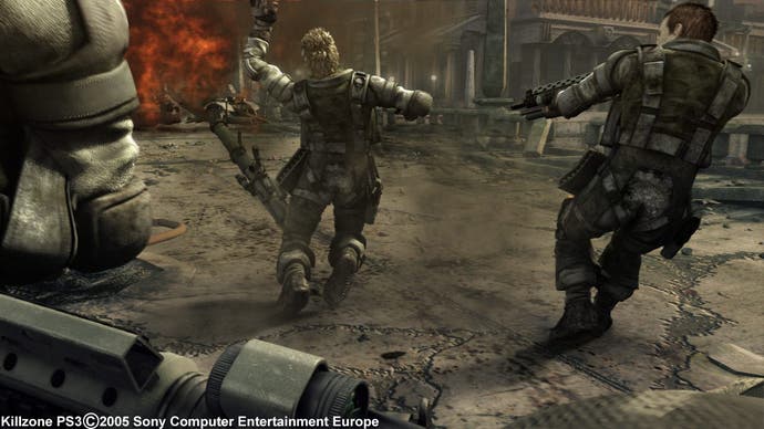
As the demo gets close to climax, we infer that the cannon took out the other barge. Hulst suggests it collects lightning and then fires it back into the sky - in tune with Sony's comments in USA Today to the effect that the Helghast harness weather systems to disrupt your assault. "You don't just have to deal with the Helghast military threat," Hulst confirms. "You also have to take on the brutal environment." In this case it's quite simple - hit a switch to expose the core of the weapon and then blast it. As soon as that's done though, a mean-looking flying vehicle zips over the roof with a mechanical snarl. Fade to black. "Killzone 2: Mission Accomplished," the black informs us. It's a fairly low key ending next to the blockbuster Gears' coronation at Microsoft's E3 showcase last year, and perhaps captures the tone: astonishingly violent, conservatively assembled.
Many factors will ultimately decide whether the overall game ends up a goodun - at the moment, beneath whatever I thought it was doing right, it's about seeking cover and finding angles to take out your enemies without over-exposing, while other things, like AI, still clearly need work, and there's no way to tell how it will be paced, whether we'll empathise with our charge, to what degree it will offer the combat variety missed in the original (although a "heavy gunner" mini-boss points to some), and how important the Helghan environment can actually prove. Likewise, we don't know what it will offer to complement Resistance: Fall of Man's multiplayer in the PS3 FPS genre, although we're told it will be 16-player and "extensive", linking into Killzone.com as well as PlayStation Home.
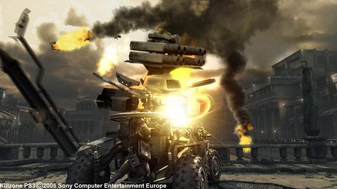
More relevant to now is to say that it's not the game we thought we saw in 2005, but that the principles aren't too far removed, and it looks undeniably good. Hulst says Guerrilla sought to create a relentlessly hostile environment, and they have. Next to the original trailer it's comparably cinematic, resolutely frantic and capably imagined, with touches that other FPS games wouldn't reject if they'd thought of them. See what you make of the trailer they're releasing on PlayStation Network over E3, but I'm more interested now than I was, and quite happy to give it the benefit of the doubt for a bit until the pad's in our hands for the first time. And I'll tell you what - it looks a f*** of a lot better than that rubbish screenshot.

