Five of the Best: Maps
Never eat shredded wheat.
Welcome to another week of Five of the Best, a series celebrating the lovely incidental details in games we tend to overlook. So far we've celebrated hands, potions, dinosaurs, shops and health-pick-ups - an eclectic and specific bunch! The sprinkles of charm games are tastier for. Here's another five for your Friday lunchtime. Today...
Maps! Lovely old maps where be dragons. The spellbinding tease before a story. Maps promising ornate cities, bushy forests and bumpy mountains. Maps with dark caves, smouldering volcanoes and strange beasties. Maps of great adventure and excitement yet to be had.
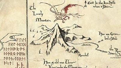
The first map I really remember was The Hobbit. I'm sure it's the same for many of you. That simple map drawn by a dwarf. That simple map followed by dwarves and hobbit and wizard, there and back again. It's not the fanciest map - it's not as detailed and sprawling as The Lord of the Rings' map - but it had all the mystery and intrigue it needed to glue my eyes to it, to wonder when - if - we'd ever get to the end, to Smaug.
That love of maps continued with games. Do you remember the gorgeous cloth maps games used to come with? Oh my! Why did that ever change? Richard Garriott's Ultima series was brilliant for this - he seems to understand a map's power so well. I spent hours looking at Ultima Online's map, at the evocative dungeon names - places I was nowhere near powerful enough to explore so they bloomed in my imagination.
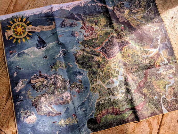
But packing maps hasn't completely vanished. CD Projekt Red has a fondness for the old ways, so The Witcher 3 came with a beautiful illustrated map. It's so colourful and fanciful - the sea monsters, particularly - it's a pity the game doesn't have the same art style (though it's beautiful in its own right of course).
Maps are a stable of any fantasy adventure, really - any world you spend a long time in. Skyrim's satellite-style map really brought out the power of the jagged, snowy mountain ranges. The gradual shading of Dragon Age: Origins' parchment map was an effective way to reinforce the spread of the game's evil, the Blight. Mass Effect's Galaxy Map is jaw-dropping, and a clever way to remind people of the majesty and vastness of space.
There are so many wonderful maps I cannot possibly name them all, but here are five of my favourites for various reasons. Naturally, you will have yours and I would love to hear about them below.
Dark Age of Camelot
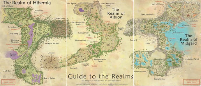
It's a map of a fantasy land you're yet to explore, which in itself is exciting, but the real magic comes from there being three lands, three realms, three sides - and each are inaccessible to the other. If you decide to inhabit Albion (a kind of England), for example, you can't also explore Hibernia (a kind of Ireland) or Midgard (a kind of Scandinavia), and nor can they do likewise. The warring sides are separated, destined to only ever meet in nervy contested zones populated by capturable keeps and housing your side's powerful relic.
Yet, you can see these other lands on the Dark Age of Camelot map. You can see them and wonder what life is like for the people in them. You can wonder how your enemies grew up, where they levelled, what dungeons they frequented, the memories they made. You can see them and imagine, which is always a beautiful, romantic thing to do. It's also a powerful way to underline the game's big realm war idea, to remind you that other people are out there, and one day you will face them...
Grand Theft Auto
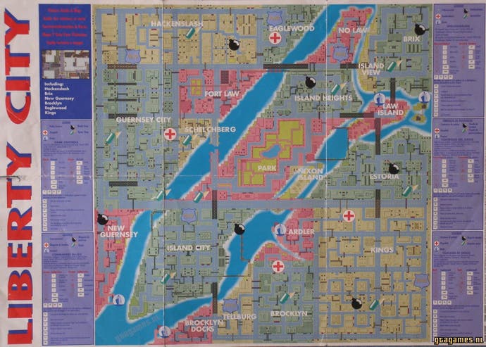
It wasn't only fantasy games which had out-of-the-box maps. The original Grand Theft Auto had one and you had to use it. There wasn't a big in-game map you could refer to. If you needed to know where the nearest spray shop was after pulling a heist and being chased by the police, you needed a navigator - someone in the passenger seat. I played that role for a friend. He'd do the arrow key work and I'd have the map in my hands, bossing him around the city. "No don't take that turning you idiot!" "Spray shop coming up on your right now now now!" "No I won't just stop and ask someone - I can work it out!"
Super Mario World
Super Mario 3 was the first Mario game to have maps - and they were wonderful. But while it allowed you to pick a path through each themed area, it stopped short of sticking the whole thing together. This is where Super Mario World comes in: a whole set of continents, adrift in the ocean, and with such lovely names! Cheese Bridge! Donut Plains! Vanilla Dome!
Mario World's map was a gorgeous piece of work in its own right, and it did an incredible job of getting you set for a Mario adventure of much wider scope. But it did more than that too. Mario World levels often had more than one exit, which meant that the game's true end-game came not with defeating Bowser but with unlocking absolutely every location available. On a functional level, the Mario World map is a bit of a puzzle, then, not as intricate as the interlocking worlds of Zelda's Link to the Past map but certainly building on the same principles.
And again, just look at it. What a beauty.
Kingdom Come: Deliverance
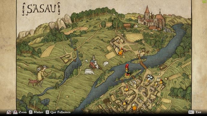
The maps in Kingdom Come: Deliverance are the most beautiful of any medieval role-playing game - maybe any role-playing game full stop - I've ever played. They're hand drawn and have a kind of childlike enthusiasm to them, all curvy edges and simple, strong lines. They almost look woven from certain angles. The diagonal-down viewpoint only enhances this, giving real substance to the friendly furrowed fields and dinky houses and huts.
It's as if the maps are concerned more with looking pretty than being geographically accurate (although, skilfully, they still manage to be). This ramps up tenfold wen you zoom into an individual map for a specific town or city. Here, the diagonal view is even more pronounced, hills and landmark features even bigger. There are even giant people adorning the map, drawn to represent the kind of industry the area is famed for. Gorgeous and useful as it gives you a sense, at a glance, of what the place is about.
Also, cloud-cover is represented literally, as curly-lined clouds gradually clear from the map the more you discover of it.
Sea of Thieves
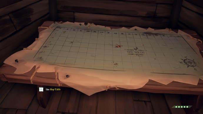
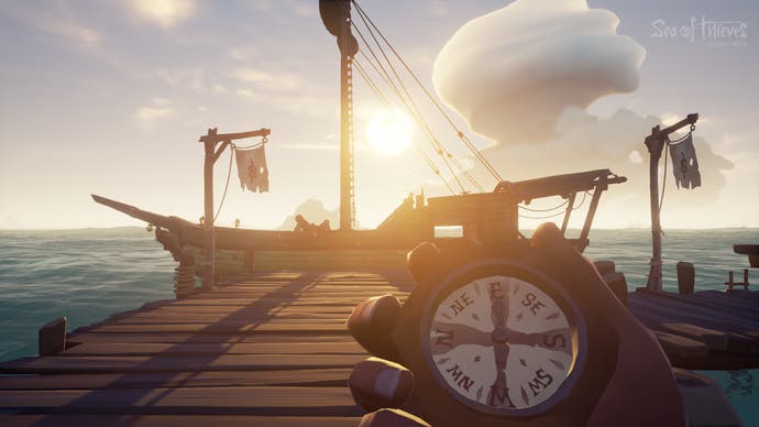
We're spoiled these days, always having giant auto-maps to hand - great charts which fill themselves in as we explore. But I suppose a good user experience dictates we have to have them - we have to know where we're going. The map is an aid and not a part of the game itself. Or is it? When I first played Sea of Thieves, I couldn't even work out where the bloody map was!
Turns out, it was on a table on the deck below - fixed to it. You can't carry a magical map around with you. You have to chart your progress on your ship's map, either leaving the wheel to do it yourself, or having another crew member relay it to you. You even have to cross-check treasure maps against it, looking for similar shaped islands to set sail to.
Reading the map, in other words, is part of the game. Not only does it encourage teamwork but it couldn't fit the nautical setting of the game better. You steer by rough bearings, by West Northwests and the like, not by exact coordinates, so it becomes a game where you spend less time looking down at the particulars and more time looking around, at the hypnotic rolling sea and the horizon, where the sails of other ships may suddenly appear...
