Drawn to Life: The Next Chapter
Pen and ink.
The original Drawn to Life was based around an interesting idea, half-heartedly realised in the guts of a mediocre platform game. Two years on and this sequel brings the series to the Wii for the first time, but sadly falls into the same trap despite addition of several new elements.
Sequel is perhaps a misleading term, since in many respects this is more like a slightly enhanced remake. The plot, such as it is, echoes the last game very closely while the gameplay fits snugly into the same old mould. The rotund inhabitants of the hub world Raposa Village - a sort of cut-price Animal Crossing - are once again menaced by a mysterious villain, whose scheme involves taking the precious things of the village and hiding them at convenient intervals at the end of numerous themed stages.
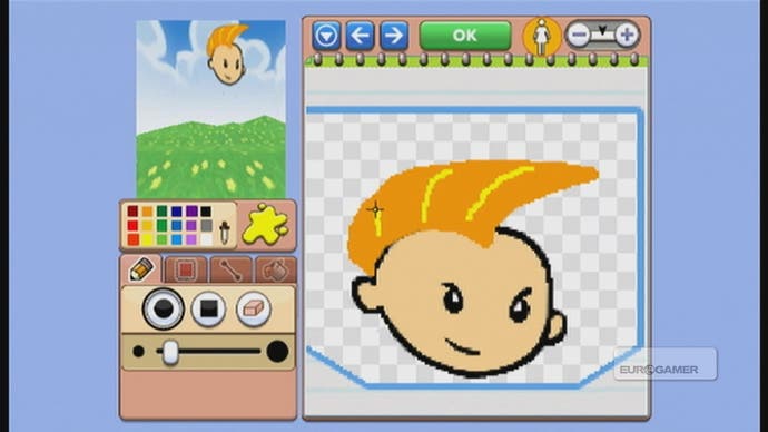
There's nothing wrong with a little adherence to formula, of course, but the problem with Drawn to Life has always been that its uninspired construction isn't elevated by the vague stabs at innovation elsewhere. That innovation, as with the last game, is that you can draw some of the objects and characters that will populate the game. As tempting as that sounds, the structure of the game is such that there's rarely much point in doing so.
One of the most immediate issues is the Wii itself. With its stylus, the DS is obviously well-suited to a game that involves drawing items directly into the game. The previous game's sketchpad was a little clunky, but at least you were holding a tangible pen-shaped object and drawing on a physical surface. Needless to say, holding the Wii remote aloft like a dart and doodling in thin air fails to produce the same instinctive penmanship. The drawing tools are surprisingly sophisticated, but producing something worthwhile is still fiddly and it's too tempting to save time and opt instead for the pre-designed templates, which instantly shame whatever crude doodle you were attempting.

With your elbow braced against the arm of a chair, and a steadying hand on the wrist, it is eventually possible to produce coherent images that aren't mortifyingly embarrassing, but the game never really justifies the effort required. For one thing, most of the time you're being asked to draw completely pointless background details. These accumulate over the game, so that the game's visual style slowly becomes your own, but even so, it's hard to muster the enthusiasm to painstakingly craft a tiny butterfly or toucan's beak that will only ever appear a few pixels high on-screen as you trot past. Too many of the game's key visual elements are locked off, out of reach, leaving you to merely scribble in the margins.
When the game does ask you to create something integral to the gameplay, it's fairly crude in the ways it incorporates it. An early example is a bridge in the Raposa Village. You're given a large template area to fill, but if your drawing doesn't reach the top of the allotted area, your character will simply hover across the gap - carried aloft on the invisible outline of the object it expected you to draw.
When it comes time to design your own platforms, this proves especially problematic - precision jumps are hard to judge when objects are surrounded by invisible edges. It seems like things are looking up when you're later asked to design a car, but the area available for your design is restrictive, and the end result unconvincing. The sloppy, wonky physics race that follows does, at least, provide an answer to the question "What would Trials HD look like if it were designed by a monkey on MS Paint?"

