New Super Mario Bros. U - a whole new world?
HD Wii emulation vs. Wii U - Digital Foundry on how the Mario makers have utilised Nintendo's new hardware.
One of the big highlights of the holidays would undoubtedly be the arrival of Nintendo's Wii U launch title, New Super Mario Bros. U - a reprisal of a familiar formula that now lets us crank the player count up to five, and also play the game solely via the GamePad's LCD. As if to imply the tussle of the Wii version's multiplayer mode wasn't manic enough already, this new release allows a fifth person to lay down platforms via the touch screen, delay the march of Koopa Troopers, and even reveal secret 3-Up blocks to the other four players. Of course, there's nothing to stop them abusing their new-found powers, supposing they've just had a rough day at the office.
It's a sightly game too, brimming with bright, pastel-coloured stages and with an image quality that has been greatly clarified by the Wii U's digital HDMI output. Indeed, Mario Bros. U also marks the first title in the series to reap the benefits of a bump to 1280x720 native resolution, which, in practical terms, makes it far easier to decipher the on-screen action once the camera pans all the way out. With that 640x480 resolution barrier removed, we can see Nintendo's worlds and characters in all their splendour - but it also means there's little it can hide.
The canon of "New" 2D Mario games takes pride in its simple-but-effective visual design and even running the preceding New Super Mario Bros. Wii through the Dolphin emulator at 1080p produces impressive results. However, considering the technological gap between that release and the latest Wii U version, we'd hope that Nintendo has developed the visuals of the game beyond a resolution bump alone - perhaps with an increase in character detail, higher resolution textures, or additional effects. It begs the question: have changes been made this time around, and if not, where might Nintendo have dug its heels in?
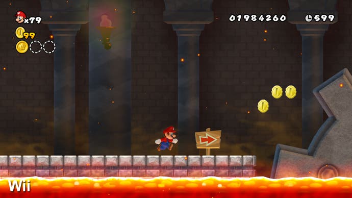
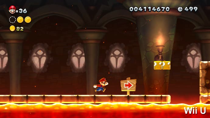
To answer this, we've put our experimental hats on over the holiday break, and captured stages from New Super Mario Bros. U, before proceeding to pair them against similar stages in the Wii version. The idea is to look at asset quality alone in comparable instances and so, for the sake of visibility, we've captured the Wii version running through the Dolphin emulator at a matching 1280x720 resolution.
"There's a significant technological gap between Wii and Wii U - so how have the creators of the world's greatest platform games utilised the horsepower of the new Nintendo console?"
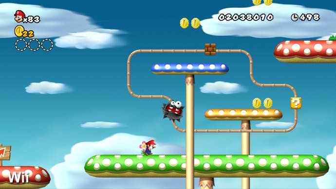
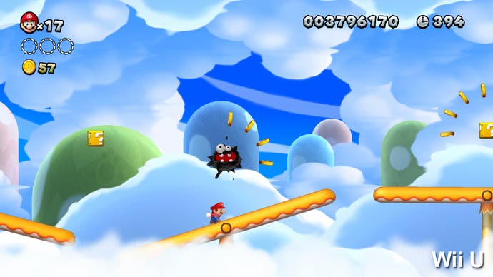
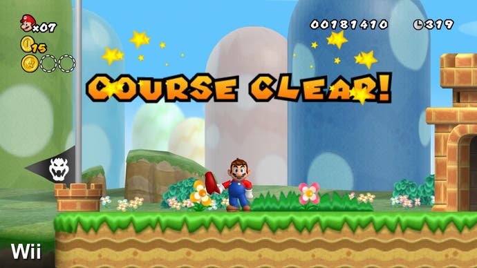
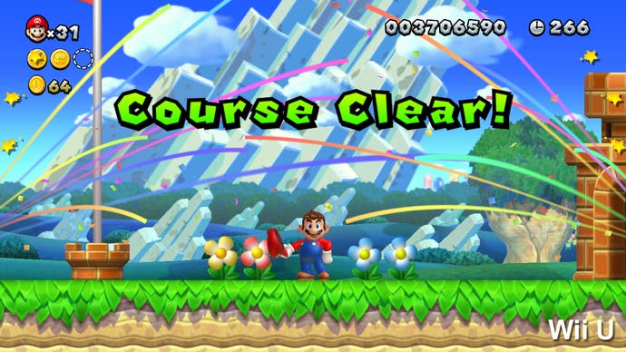
Looking at Mario and Yoshi in action in the first stage, it's impossible to pick out any evolution in detail. Character models with higher polygon counts aren't in evidence at all when compared up close and the leading man's running animations appear identical when measured to the frame. Nevertheless, he does look radically different depending on the nature of the environment; a huge advance in the lighting method is the cause here, which greatly helps to blend characters with the elements of each stage. For example, the plumber's face lights up when stood near lamps in dimly lit mines, while lava forces a red glow to play across his clothes as he passes a rising fireball. By comparison, the lack of such lighting in the Wii version can make characters seem much duller. Also worthy of note is the anti-aliasing situation - the Wii game in its original form possessed no discernable AA (something that can be addressed via emulation though). On Wii U, we appear to be seeing an edge-detect solution reserved for characters and objects only, with environmental detail remaining unprocessed.
Other improvements include higher resolution alpha for dust clouds, which appear at Mario's feet wherever he runs as opposed to just during sliding and landing animations on Wii. The sharp-eyed will also spot the spark effects after bopping Goombas bring out a bright bloom effect, which only appears as a simple sparkle animation in the preceding game. The detail bump on the static gold coins is also a huge step forward, with the blocky 2D sprites seen on the Wii version being eschewed in favour of the fully polygonal, spinning kind on Wii U. Otherwise, the large coins - appearing three times on each level - appear to rely on the very same 3D model as before.
Looking at enemies paints a less consistent picture; in the transition to new hardware not all have received the same level of attention as others. We see the basic appearance of ivy-covered Bramballs and giant Grouper fish holding the same detail levels as before, while the ink-blot-esque Fuzzies have been given a noticeable redesign. In the Wii U version, black, residual drips are flicked in every direction as they wind up and down the skyline of the Meringue Clouds stages. By comparison, the implementation on Wii looks decidedly more geometric in design and as a result flatter and more solid. For a new look, this fits in beautifully with the colourful ink-jet aesthetic of the rest of the stages in this world.
"The Wii U game is rife with improvements but it's interesting to note that the most crucial 3D model - Mario himself - appears virtually unchanged from its Wii incarnation."
New Super Mario U's oil-painted look exaggerates the further you push through the game, starting subtly with the blotted green leaves in the Acorn Plains, but coming to a dramatic head during the Painted Swampland stage in the Soda Jungle. The hypnotic, dark-coloured swirls of the background brings to mind a very specific visual reference point - arguably an idea that could have been applied to equal extremes for each of the game's eight worlds, with each their own inspiration. Even so, the level represents a welcome flash of visual flair that brings to light Nintendo's preference for art direction over any technical gimmickry.
In this sense, the game is very conservative in its structure but tries to find freshness within its own parameters. Both it and its predecessor stubbornly hold to the same world progression, each running through the gamut of plains, deserts, icy glaciers, jungles, and mountain stages in much the same order. However, the interpretations of these themes can be unrecognisable at times with the Wii U version's backgrounds revealing fully animated waterfalls, flying enemy airships, and giant acorn trees surrounded by rolling clouds. A stronger sense of depth to the world is created behind Mario this time around, largely due to the more regular use of fully polygonal elements - such as the airships - which blend in convincingly with the other scrolling layers.
As far as interactive foreground elements are concerned, it's a mixed bag. The destructible blocks, green pipes and empty castles of the Mushroom Kingdom are as simplistic as ever, but are noticeably sharper than the emulated Wii version's. Other elements, such as the lava and water transparencies bubbling at the bottom of the screen, are carried over directly to the new version with only minor alterations.
"The power of the new hardware is utilised via enhanced effects work, more enemies on-screen and via more ambitious 3D work in selected environments."
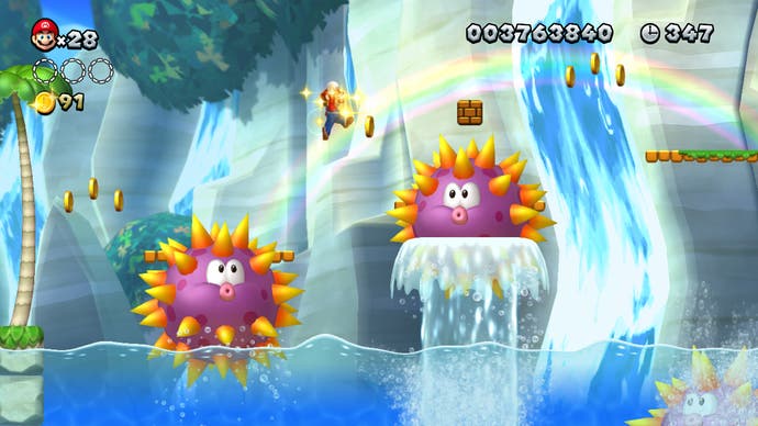
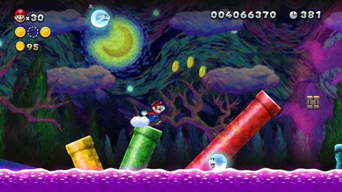
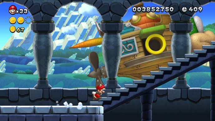
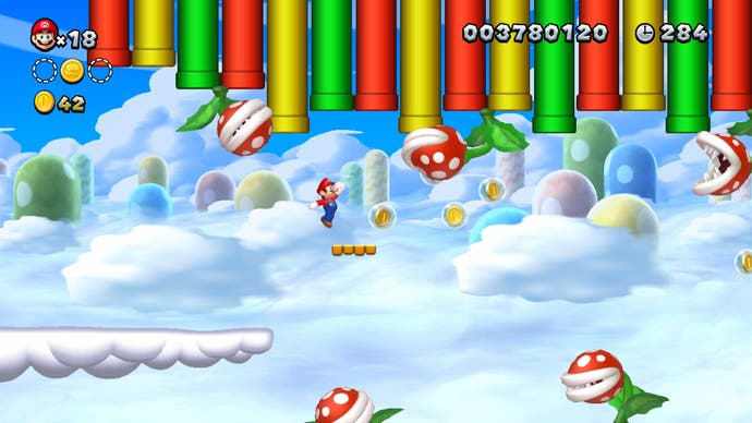
On the plus side, we see traversable 2D terrain like grass plains, sand pillars, ice sheets and mineral blocks being designed with more of a pastel-style "pop" to them. It's eye-catching, though may not necessarily always be strictly higher in detail; these can on occasion appear simpler than before to achieve an eye-catching two-tone effect, fitting in with the game's punchier colour scheme. In the grand scheme of things though, we do see most assets sporting crisper borders and more fine details - such as the sand pillars on the desert stages, rising up from the ground with a more granular look.
The over-world has been given a complete refresh, with a far-reaching sprawl of locales that hark back to the days of Super Mario World; now it's possible to travel wherever you like, with no interruptions between each area. It's here that we also get to strip Mario from his usual 2D plane and plant him in a more dynamic environment, with green pipes blasting him all the way across the map as a means of fast travel. Unlike the Wii version, which gets by with a simple black circle beneath the character to represent a shadow, we now have a more precise method that casts the throw of his hands and feet as he runs from dot to dot. As with the lighting changes, these are enhancements we've already experienced on Wii before in Mario Galaxy and will hopefully be expanded on once again for the next fully 3D Mario title.
The seamless nature of travel between each world translates to the game's sound design as well. The orchestral mix of the Mario Galaxy series is missed here, but relying on the Wii U's integrated sound processor - likely the same 16-bit Macronix chip used since the Gamecube - to generate synth sounds has its advantages. For starters, the music can synchronised to the rhythm of enemy animations, dynamically bump up the tempo when the timer is running out, or add in new layers of percussion when riding on Yoshi's back. As far as the world map goes, just jumping from Acorn Plains to the Layer-Cake Desert smoothly swaps out the upbeat moog synth and xylophones for a guitar and tambura-style drone.
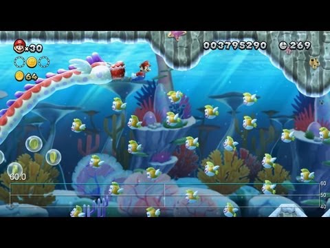
"The Mario control interface remains untouchable - thanks in no small part to a locked 60 frames per second update that never shows any sign of compromise."
New Super Mario Bros. U: The Digital Foundry Verdict
With the release of New Super Mario Bros. 2 on 3DS just a few months earlier, the concern was that Nintendo may be playing it too safe with its mascot's main-line appearances. Early demo footage of the game, first unveiled at E2 2011 as New Super Mario Bros. Mii, even showed background assets being used from the Wii version's desert stages, such as the pyramids and cacti. Fortunately, the final Wii U release steers clear of rehashing anything to quite that level - though there has been some duplication involved as far as the over-arching structure is concerned.
To summarise, we see Mario and most of his adversaries making the jump practically as-is from the Wii edition released three years ago, with no noticeable rejig in detail. Even so, an effort has clearly been made to push the series forward technically, with dynamic shadows, higher resolution alpha, and lighting making an appearance to subtle effect, and most level assets built completely from the ground upwards. We also appreciate the move towards stylising the backgrounds and some enemies with what appears to be an oil-painted finish, rather than blindly taking advantage of any technical tricks afforded by the stronger hardware for the sake of it.
It's perhaps also a frustration that the visual styles Nintendo are touching on here - such as the Vincent van Gogh-inspired stage - aren't getting more breathing room, and that other styles of that extreme aren't represented in later levels. Nevertheless, modest as it is, New Super Mario Bros. U marks a promising technical leap forward over its predecessor; not just for the resolution boost up to 720p but also for the range of subtle visual tweaks that accompany it.
