Tech Evolution: Forza Motorsport 3
Forza old vs. Forza new vs. Gran Turismo.
The stark lighting offers up a couple of interesting insights on the rendering tech. The player-car's shadow is darker and more defined, though filtering can look worse depending on the angle (occasionally you'll see the odd serrated edge). There's also a more consistent approach to shadowing between the player's car and the AI opponents. In Forza 2, shadow definition is pretty good on the player-car, but on the AI it can look pretty poor. This is fixed in the sequel.
There's also evidence of clear leaps in the graphical quality of the environments. Foliage "pops in" on Forza 2, while it doesn't in the sequel. Texture resolution on the environments appears to have improved too, most notably on the track-side hoardings in this case.
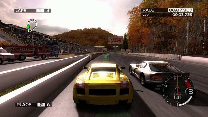
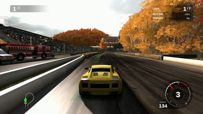
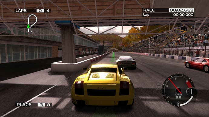
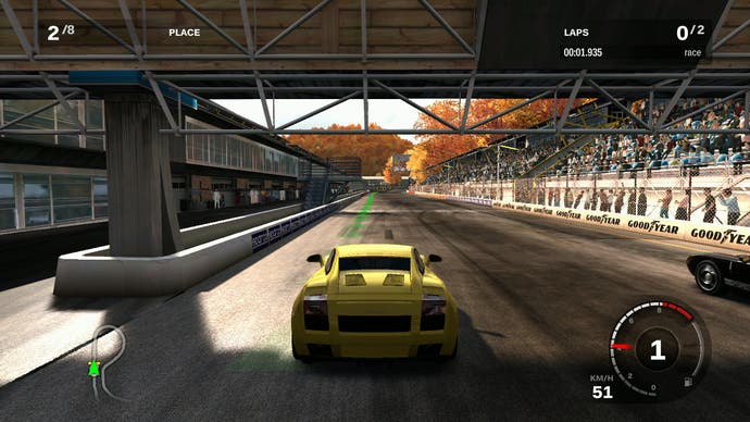
The Maple Valley track is our next destination and this is a pretty decent example of how the artists' sometimes-wacky lighting schemes have been dialled back significantly in the sequel. It's most noticeable on the car itself where a bright reflection/bloom combo has been removed. High-frequency aliasing on the engine grills above the engine is lessened, and there's a more pleasing-looking shader in effect for the rear cover lights.
There's superior environmental shadowmaps in effect, more pleasingly defined reflections on the buildings, and generally more consistent lighting all-round, for example under the bridge.
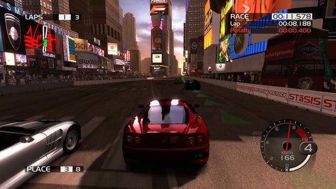
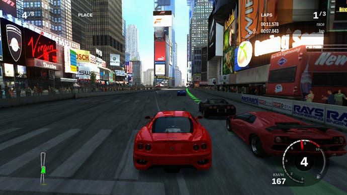
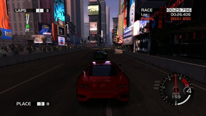
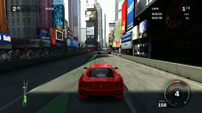
Another circuit that the Forza games have in common is the New York track, also found in the most recent Gran Turismo titles. Lighting has been adjusted dramatically to produce an overall more pleasing look. Once again, some of the oddly bizarre artistic decisions here have been adjusted to look closer to reality: for example, the reflection on the car in Forza 3 is no longer brighter than the sky it is supposed to be reflecting (!) and the definition of the reflections themselves is also much improved.
So, when you've laboured long and hard over what looks like an almost complete re-write of key stages of the rendering pipeline, producing improved recreations of the circuits you've already done can be seen as being somewhat anti-climactic, especially when the tracks themselves can be somewhat spartan in appearance. The new lighting model combined with more detailed environment textures is all well and good, but it's effectively a more attractive remix of what has gone before and doesn't really showcase the power of the new rendering technology.
Turn 10's solution was remarkably straightforward: create a range of new tracks designed to leverage the strengths of the engine. This is where you get to see the engine at its best. As we can assume that the tech is really being pushed to its limits, it's here that frame-rate analysis of in-game action is going to be the most enlightening.
In this entire sequence, Forza 3 drops a grand total of just two frames. Turn 10 must surely be congratulated for what it has achieved here. Forza 3 is arguably the best-looking racing game on the Xbox 360, looking far superior to the majority of racing titles for the platform than run at half the frame-rate. The team's focus on visual consistency is also laudable: unlike other driving games including even the technologically awesome Gran Turismo 5 Prologue, Forza Motorsport 3 maintains its frame-rate and also employs v-sync. It also does this while maintaining a full, native 720p resolution and also 2x multi-sampling anti-aliasing.
To achieve this, there have been some sacrifices made. As we've noted many times previously, one of the great strengths of the Xbox 360 architecture is its ultra-fast 10MB of eDRAM connected directly to the Xenos graphics chip. Unfortunately, 10MB is not enough to contain a native 720p framebuffer with 2xMSAA, so instead each frame is cut down into two chunks, called tiles. Performance is impacted where objects occupy both tiles, as effectively they need to be drawn twice.
