Motorola Xoom 2 Tablet Reviews
Motorola takes not one but two shots at toppling the iPad - is either successful?
The original Motorola Xoom was supposed to be the tablet which unseated Apple's iPad and established a glorious new era of Android-powered slate supremacy. It was running Google's first truly tablet-focused OS - codenamed Honeycomb - and offered blistering dual-core processing power.
Despite the considerable hype, the Xoom ultimately failed to live up to expectation. Compared to the slim and elegant iPad, it appeared chubby and unattractive. Google's software felt unfinished, and a worrying lack of tablet-specific applications - a problem exacerbated by Google's continuing insistence that developers create downloads that are able to function across both phones and large-screen devices - made it a hard sell. Within months, the Xoom was being heavily discounted by retailers, and other Android tablets swept in to steal the limelight.
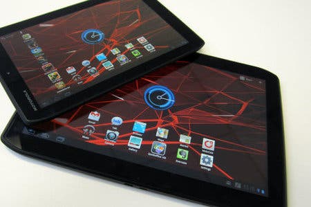
Motorola is in this game for the long haul, though. Having recently been acquired by Google in a deal worth $12.5 billion, the American telecoms veteran is back in the ring with two new tablet devices: the Xoom 2 and the Xoom 2 Media Edition. Both boast dual-core processors and 1GB of RAM, and sport PowerVR SGX540 graphics processing units. In fact, the two tablets are practically identical, save for one fairly significant detail: the Xoom 2 has a 10.1-inch screen, while the Media Edition has a smaller 8.2-inch display.
Screens: When One Size Isn't Enough
Compared to the Xoom's TFT LCD screen, the IPS panels seen on the two Xoom 2 tablets are a vast improvement. Colour balance is better, and viewing angles are excellent. The only criticism we can level is that the resolution could - and probably should - have been higher. When the iPad 3 emerges this year, it's very likely that it will move beyond the realms of the 1024x768 pixels found in current gen Apple tablet into hitherto uncharted territory (it differs depending on who you talk to, but 2048x1536 is thought to be the magic figure). Motorola could have stolen a march on Apple in this area if it had wanted - but instead, we get a display with a decidedly entry-level resolution.
Although the Xoom 2 Media Edition has a smaller screen than the 10.1-inch model, the 1280x800 resolution remains the same. This naturally results in a higher pixel density per square inch (approximately 184 ppi compared to the standard Xoom 2's 149 ppi), which means that images look somewhat sharper on the smaller tablet, with the obvious drawback being a reduced viewable area.
Design for Life
From the front, the Xoom 2 and Xoom 2 Media Edition look very much the same - the obvious difference in size notwithstanding, of course. Motorola's design team are very hot on angled corners right now, with the Motorola Droid RAZR showcasing the same unique 'sliced off' edges. The logic is that these corners make the tablets easier to hold, but we're not entirely sure they offer any benefit over rounded ones when it comes to overall comfort.
Flipping the two tablet siblings over reveals a slightly different story; from the back, it's very easy to tell them apart. The Xoom 2 has a metal rear surrounded on three sides by rubberized plastic, with the top portion being given over to a five megapixel camera. The Media Edition's metallic backing is flanked by this same material, but on all four sides rather than just three. It also boasts visible screw points, which lend it a rather fetching industrial look.
We've already touched upon the original Xoom's portly 13mm thickness, and it's reassuring to note that Motorola has clearly learned from its mistakes. Both Xoom 2 tablets are slimmer, clocking in at 8.8mm (10.1-inch model) and 9mm (8.2-inch model). It might not sound like much on paper, but in reality the difference is tangible. These new versions are lighter and consequently more pleasurable to use; the previous Xoom put a serious strain on your arms if you held it for prolonged periods.
Surprisingly, it's the more diminutive variant that meets with the most approval. At 386 grams, the Xoom 2 Media Edition is light enough to cradle in one hand, and its smaller size means it's also more portable. The standard Xoom 2 is hardly a dead weight at just under 600 grams (the previous Xoom was something of a monster at 730 grams), but if pushed, we'd pick the Media Edition as our travelling companion.
Android 3.2 - Not Quite the Latest Flavour
Android 4.0 is already with us - it's installed on Samsung's Galaxy Nexus smartphone, which launched at the tail-end of 2011, and has recently been pushed to the Asus Transformer Prime and the selected models of the original Xoom. Codenamed Ice Cream Sandwich, this iteration of Google's mobile OS is intended to tie together the previously separate phone and tablet versions into one cohesive whole. Sadly, neither the Xoom 2 or its smaller relation benefit from this new software, as they both ship with Android 3.2.
To the untrained eye, this will present no real cause for concern. Android 3.2 remains a solid example of a tablet OS; it's relatively quick, offers a wide degree of user customisation and has features such as active widgets and true multi-tasking. However, it's frustrating that Motorola has launched this device with what is essentially last year's OS. The company will no doubt update both products to Ice Cream Sandwich in the fullness of time, but if it was truly serious about positioning the Xoom 2 models as next-generation tablets, Android 4.0 should have been a given right from the start.
Both Xoom 2 tablets have the same internal CPUs, with 1.2GHz dual-core Cortex-A9 processors beating at their hearts. This is a step up from the 1GHz dual-core CPU seen in the original Xoom, but whether or not it's a big enough one is less certain. The PowerVR SGX540 graphics processor seems to skip along with more pace than the GeForce chip seen in the previous model, and when benchmarked alongside the original Xoom using the Neocore 3D test, both Xoom 2 tablets punch around the 50FPS mark - an improvement on the rather less striking 35FPS offered by the original Xoom.
"The Xoom 2 Media Edition is light enough to cradle in one hand, and its smaller size means it's also more portable. The standard Xoom 2 is hardly a dead weight, but if pushed we'd pick the Media Edition as our travelling companion."
It's a step up, but the performance increase isn't as different as we'd hoped it would be. Compare and contrast this with the Asus Transformer (launched after the first Xoom) and the more recent Transformer Prime. The Prime has a quad-core CPU running at 1.5GHz, putting it in a whole different league of processing power. It's hard not to feel that Motorola's products haven't matured in quite the same emphatic fashion. Similarly, the GPU comes up short compared to the dual-core PowerVR SGX543 found in the iPad 2.
Elsewhere, some features have been added while others have been taken away. Owners of the original Xoom will be pleased to learn that you no longer require the bulky wall charger to top up the battery; both Xoom 2 models allow charging via a standard micro USB connection - the same one that your Android phone uses, in fact.
However, the same Xoom veterans will be disappointed to hear that memory expansion is now a thing of the past. It's not possible to augment that 16GB of on-board storage, and 3G connectivity is also off the table. It would appear that these features were omitted rather late in the day, as both tablets have a mystery plastic flap which can be opened to reveal a blank space which looks suspiciously like it was intended to hold a 3G SIM card and micro SD card slot. Perhaps these two elements were removed from the spec after the case design was finalised, or maybe they hint at future models with increased functionality? Whatever the answer, it's unlikely to placate those looking to upgrade from their existing Xoom tablet.
Gaming Credentials, Camera Specs and Battery Life
Thanks to their reasonably nippy GPUs and responsive capacitive touch-screens, the Xoom 2 duo make surprisingly decent entertainment platforms. 3D titles such as Anomaly Warzone Earth and Blood & Glory tick along a fair old rate, and high definition games like Fieldrunners HD and Majesty: Northern Expansion run equally smoothly. However, given the astonishing pace of Android game development these days, it's highly likely that before the year is out we'll be seeing some console-quality titles hitting mobile devices - albiet limited to those with quad-core CPUs.
If that proves to be the case, then Motorola may well regret not giving this pair of tablets better CPUs to play with. The Xoom 2 and Xoom 2 Media Edition are more than capable of dealing with modern Android games, but they're behind the curve in terms of raw tech.
The five megapixel camera on both tablets remains unchanged from last year's Xoom. It continues to offer high-resolution shots, but they possess a curiously washed-out tint, and the auto-focus system is just as sluggish as before. Worst still, there's no option to 'touch-to-focus', although that should hopefully come hand-in-hand with the eventual Android 4.0 software update.
"The Xoom 2 and Xoom 2 Media Edition are more than capable of dealing with modern games, but they're behind the curve in terms of raw tech, as Android tablets transition towards quad-core power."
720p video recording is possible, but the omission of full 1080p HD capture is puzzling - especially when rival tablets are offering this capability. It's unlikely that anyone will look upon either of these two devices as potential replacements for their traditional hand-held video camera, and it's a good thing, too. Footage is fuzzy and dull, and the auto-focus does its level best to lock onto anything but the subject you intend.
At least Motorola has made it easy to enjoy the fruits of your labour. Located next to the microSD charging and data port is a mini HDMI-out socket. This allows you to mirror the tablet's screen on your TV set, and offers a quick and relatively painless route to sharing your snaps and videos with family and friends. A even more appealing application would be playing games on a larger display, or streaming Netflix to your telly via your tablet.
The 10.1-inch Xoom 2 has a Li-Ion 7000 mAh power cell, while the Media Edition has a 3960 mAh variant. The disparity in capacity results in a predictable difference in stamina. The 10.1-inch Xoom 2 is good for around 8 hours of continual usage, assuming you don't have the screen on full brightness. If you're looking for a figure based on daily use, you can expect the Xoom 2 to last well over 24 hours before it starts gasping for the plug socket.
The Media Edition can't hope to hit those numbers, offering around 5 to 6 hours of usage and approximately a day on a single charge. It's hardly a massive shock, but it's a shame that the smaller Xoom 2 doesn't have the legs of the its larger brethren, as it's a much more appealing proposition when it comes to portability, and would have benefited from increased staying power.
Motorola Xoom 2: The Digital Foundry Verdict
"With Asus' Transformer Prime setting a new high watermark when it comes to tablet power and the iPad 3 looming menacingly on the horizon, it's difficult to recommend either Xoom 2 model at their current price-points."
Motorola has been seen as something of a trend-setter in the Android field. When it launched the Droid phone back in 2009, it was seen as the first truly essential Google Phone. Last year's Xoom marked the debut of Android Honeycomb, heralded as the best tablet OS on the market.
Strangely, there's no sense of grandeur about either of these new Xoom 2 tablets. Granted, they look better than last year's dumpy model - hardly a triumph in itself - but aside from a slightly more powerful processor, things haven't changed a great deal. In fact, with the absence of 3G and memory expansion, it's possible to argue that this year's package is inferior to last year's. While the tech is more powerful, it feels like Motorola is making baby steps as opposed to the giant strides taken by its competitors.
With Asus' Transformer Prime setting a new benchmark when it comes to tablet power and the iPad 3 looming menacingly on the horizon, it's difficult to recommend either Xoom 2 model. If they'd been priced a little more competitively - the Xoom 2 is £380 while the Media Edition is £50 less - it's possible they could have found a niche in the dangerously overcrowded tablet market, but with the iPad offering more downloadable content and the original Xoom being sold for over £100 less than the Xoom 2, it becomes impossible to shake the impression that Motorola has missed its chance.
