Antichamber Preview: Dear Escher
A very, very different kind of puzzler.
"I like games that surprise me," says Antichamber creator Alexander Bruce. Standing in a crowded expo hall in a bright pink suit and tie, Bruce is certainly not afraid to write his own rules. His peculiar choice of wardrobe extends to his game design philosophy, wherein he wants games to be a constant learning experience. "I'm not as surprised by games as I used to be," he laments. "I'd like to make games that fix that."
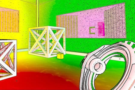
His upcoming puzzle game, Antichamber, casts you as a nameless, faceless individual plopped down in a series of test chambers. So far, so Portal. But whereas Valve's seminal first-person puzzler relied on a single idea that expanded throughout the course of the game, Antichamber refuses to rely on any one notion for too long. Instead, it's an ever-changing mishmash of spatial and logic puzzles that ask the player to constantly reassess how the world works.
An early room portrays a chasm with the word 'Jump!' Try to jump across it and you'll fall to a room below. The solution is to simply walk across - at which point a bridge forms beneath your feet - but failing to realise this doesn't punish the player.
Instead it takes them to a new area where a poster assures them that "Failure to succeed does not mean failure to progress," accompanied by a drawing of a sheep leaping off a cliff. The whole landscape is littered with these posters. Sometimes they give hints about what to do, other times they provide affirmation regarding what you jut did. Either way they help you get your bearings in this twisted world.
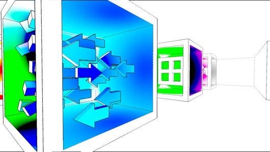
You see, Antichamber's most unique feature is in its title. These aren't really chambers or rooms, but rather spaces that restructure themselves based on a shifting set of rules. We tend to take it for granted that when we turn around, the space behind us will remain as it was. In Antichamber it's not unusual to enter a room, find yourself stuck then turn around, only to be presented with an entirely different space.
Other times large windows standing in the middle of the room function as portals to another place. Get up close and peek through them until they take up your entire field of view, and when you back up you'll suddenly be in the world they portrayed. Sometimes doors will only close if you're looking at them, but avert your eyes and the change won't occur.
Where you look matters in this game, and it makes you feel like a baby who can't comprehend the existence of things they're not immediately looking at. It's as if the game is playing peekaboo with you before tossing in loads of logic puzzles to further boggle your mind.
This sense of childlike wonder and curiosity is no coincidence. Antichamber's original title was "Hazard: The Journey of Life," and it was supposed to represent how we learn, going from a baby grasping at the fundamentals of how space operates to an older person having to use tools to make their way through an increasingly complex labyrinth.
"It's about the process that we go through while growing," Bruce explains. "So if you look at a child, for example, they don't really know much about the world - they have to learn by experimenting. If you tell a child not to touch a stove because it's hot, chances are they're going to do it anyway, because they need that experience."
In 2009 Bruce decided this idea was too pretentious and heavy-handed. He then scaled back the narrative significantly, to leave it more open to interpretation from the player. "This was only my interpretation for why it was built, but there are plenty of other interpretations as well."
When asked about this change Bruce says that he wanted to focus more on the mechanics and the experience of learning, and felt the more rigid narrative got in the way of that. "It's still a game about learning, and the process of learning. It's just not specifically about the journey of life."
The other major change between its earlier incantation and its current state is that "Hazard" had, well, hazards. You could die, but that wasn't fun. Antichamber has no death. Fall through its obtuse spaces and you'll just wind up somewhere else, giving the game a non-linear progression.
While death isn't a concern, getting stuck is. It can be very easy to reach an unwinnable state after mucking about on a particular puzzle. Thankfully, hitting escape will instantly transport you to the game's hub where a vague map portrays all the areas you've been to, and allows instant access to any such points refreshed to their original state. All puzzles can be solved independently from one another. Except for where they can't.
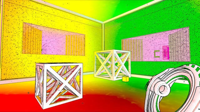
One such puzzle entitled "Not Enough Pieces" tasks you with using a set number of cubes to trigger door-opening mechanisms. Through careful consideration, you can use said blocks as door stoppers and make it out with all three pieces - only the final door requires a fourth block to open. With a little thinking outside the box one can deduce the name "Not Enough Pieces" isn't simply a hint to be judicious with each block, but rather straight up telling you, "this is impossible."
Instead the solution involves warping back to the puzzle preceding it entitled "The Butterfly Effect," a hint that your actions can have unforeseeable consequences down the line. The Butterfly Effect is easy to complete on its own, but only cautious players will get through it with the extra block needed. It's the only puzzle that's not entirely self-dependent, apparently, but it does invite you to see Antichamber's world as one shifting whole.
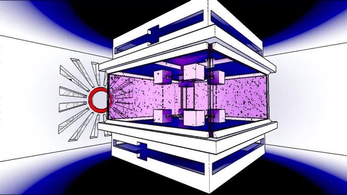
Besides the transforming spaces and fiendish puzzle design, what's most striking about Antichamber is its peculiar visual style. Walls are almost entirely white, with only splotches of colour and the occasional diagram to distinguish one end of a corridor from another. This emptiness makes the shifting spaces even harder to comprehend and adds to the dream-like vibe.
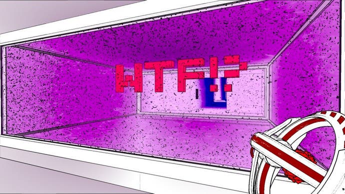
Bruce says the aesthetic is more of a happy accident, and that each piece of visual information was to have a practical purpose. Doors contain red circles in the middle with long triangular wedges carved out around them in what resembles an Aztec design, but is actually just a way to ensure players can glimpse what's behind them, while the circles are a meter that turn green as you unlock them. The art style is so elegant that it manages to be simultaneously utilitarian and surreal.
It creates a look that, like everything else about Antichamber, is aggressively unique. It could clinically be described as Myst meets Metroidvania, but I'm not sure that quite does it justice. It's more like what I'd imagine the Riddler would create if he had the controls to the holodeck. With its penchant for spatial and logic brain-teasers Antichamber may gravitate towards the cerebral, but its trippy visuals and thrill of discovery make for one of the more mesmerising virtual worlds.
